Wayfair: Accessibility Mode
Designing for inclusivity and accomodation for large interactive screens in Physical Retail

The Ask
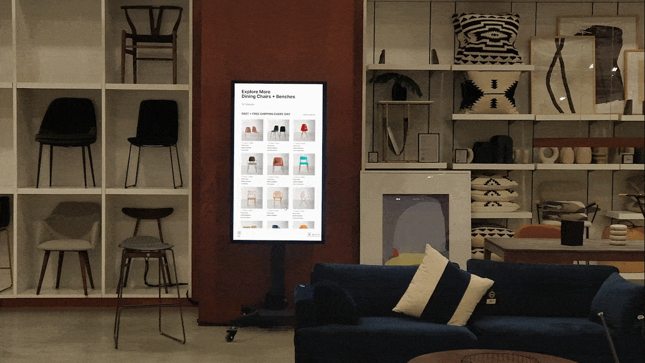
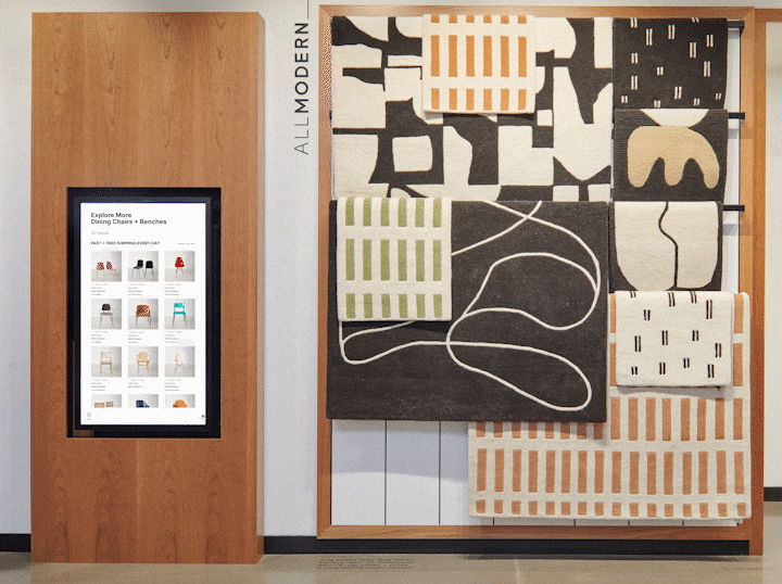
In 2022, Wayfair launched their first brick and mortar store for their Specialty Retail Brand, AllModern. A key touchpoint in their Salesfloor Digital Strategy is interactive screens. The long term vision is to see these screens become an elevated touchpoint for customer and associates in their shopping journey.
Timeline
May 2022 - July 2022
9 weeks
Project Team
Doria Fan
Fred Carriedo
Ashesh Gohil
Micaela Laney
Spencer Gregson
Riana Quinn
My Role
Design Research
UX Design
Design Strategy
Wireframes
Prototypes
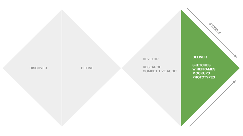
Process

Problem
How will a customer with limited accomodations browse through the products on these interactive screens?
At a glance
Large interactive screens have been used across the retail industry to enhance customer experiences in the store.
After preliminary tests for different concepts and interactivity of our Screens, it was found that further research needed to be conducted to identify how they can seamlessly integrate with the customer experience and help them purchase the right product, even when it is not on the Salesfloor.

Researching interaction patterns
As a net new platform, we needed to establish guidelines for these interactive screens. Based on usage of screens by other retailers and transportation systems, the following areas were used to set the design guidelines for the interactive screens.
A very high level user flow was created to establish what a customer would be looking for when establishing what functional accessibility would look like for these screens.
Explorations
Initial explorations included looking at mental models for users for large screens and smartphones.
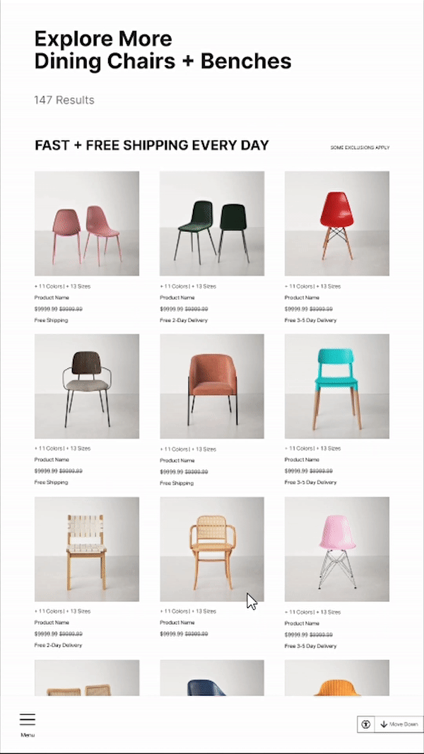
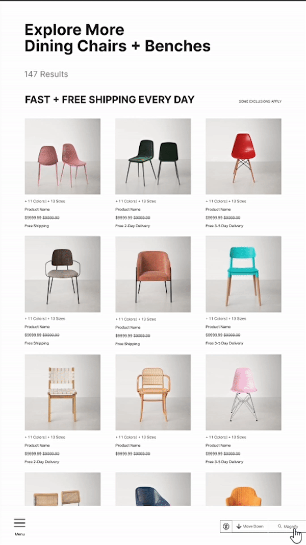
Following the users' mental models for Reachability, we explored how other interaction patterns could emerge in scenarios where the user would suddenly stop interacting with the screen, or exploring how much content would need to be prioritized.
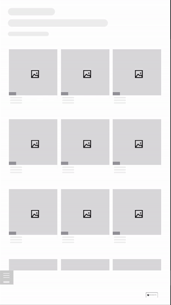
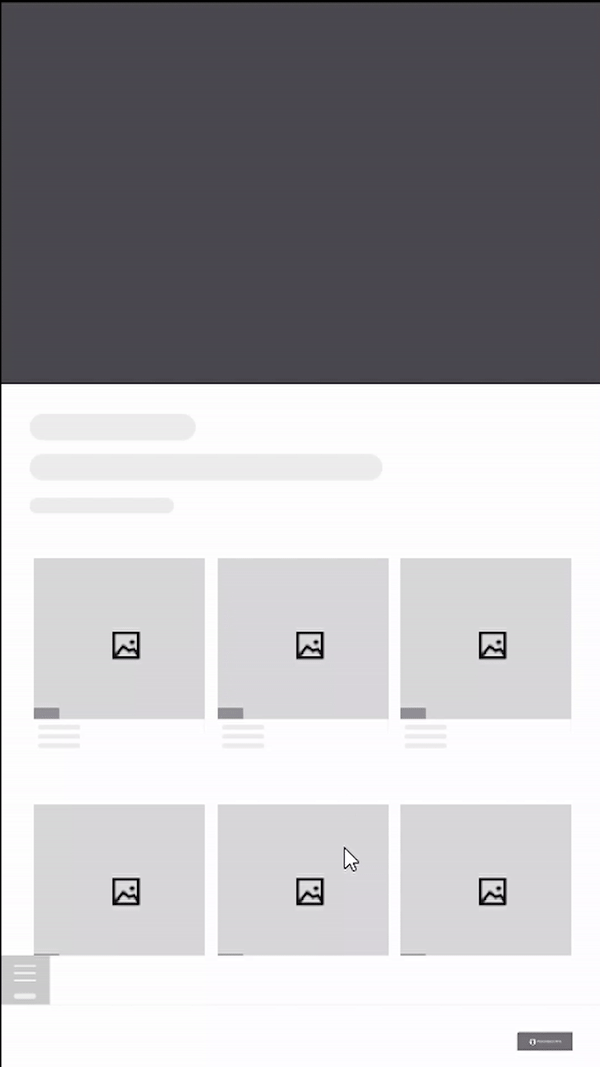
And then translated the explorations into prototypes.
Strategy
Creating the North Star
With feedback from internal stakeholders, the approach to accessibility evolved to what it could look like when Wayfair launches its own store in 2024.
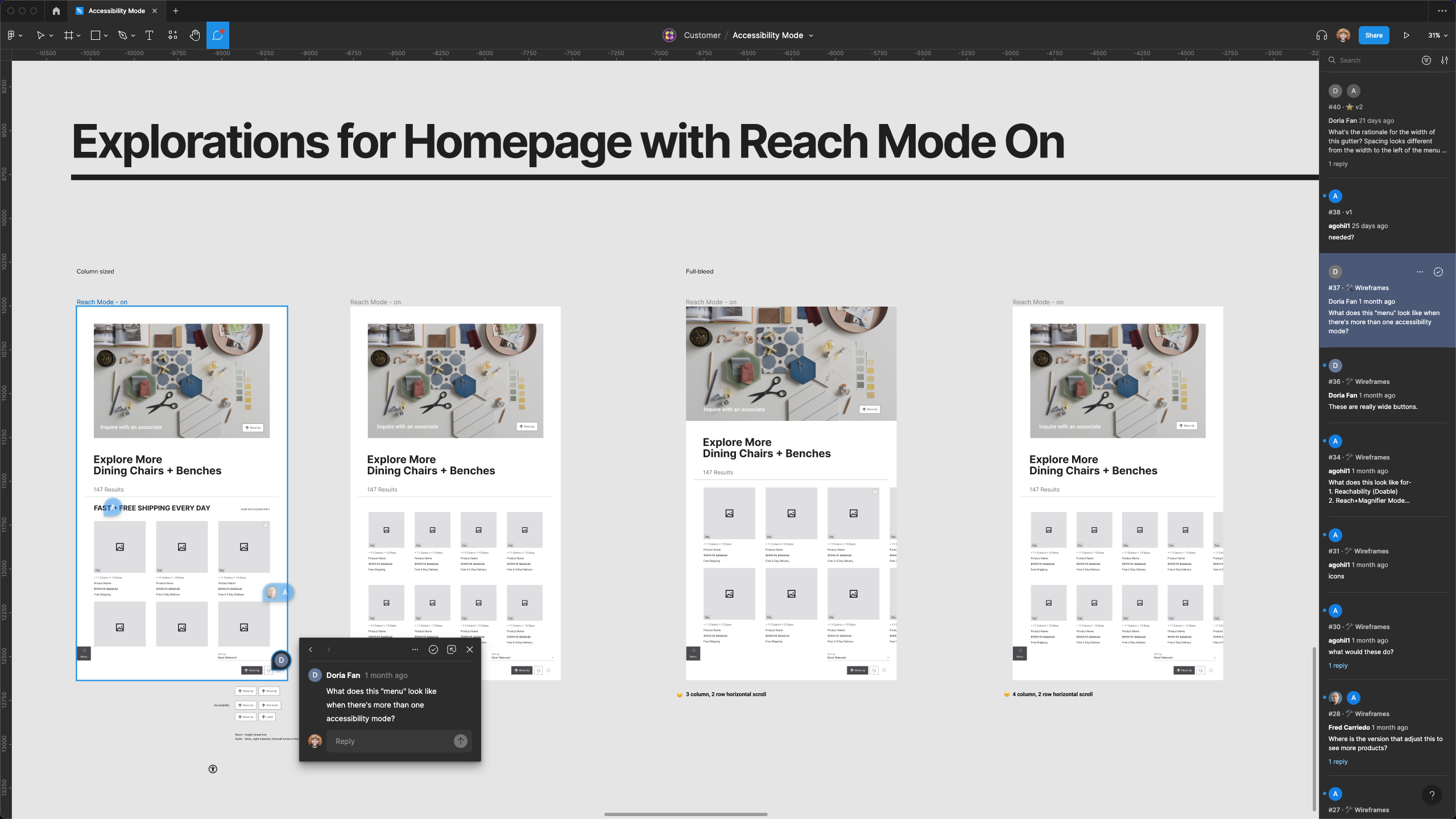
From initial to ideal version
The internal stakeholder feedback helped us envision what features each version would entail.
Takeaways
Identifying opportunities within the process
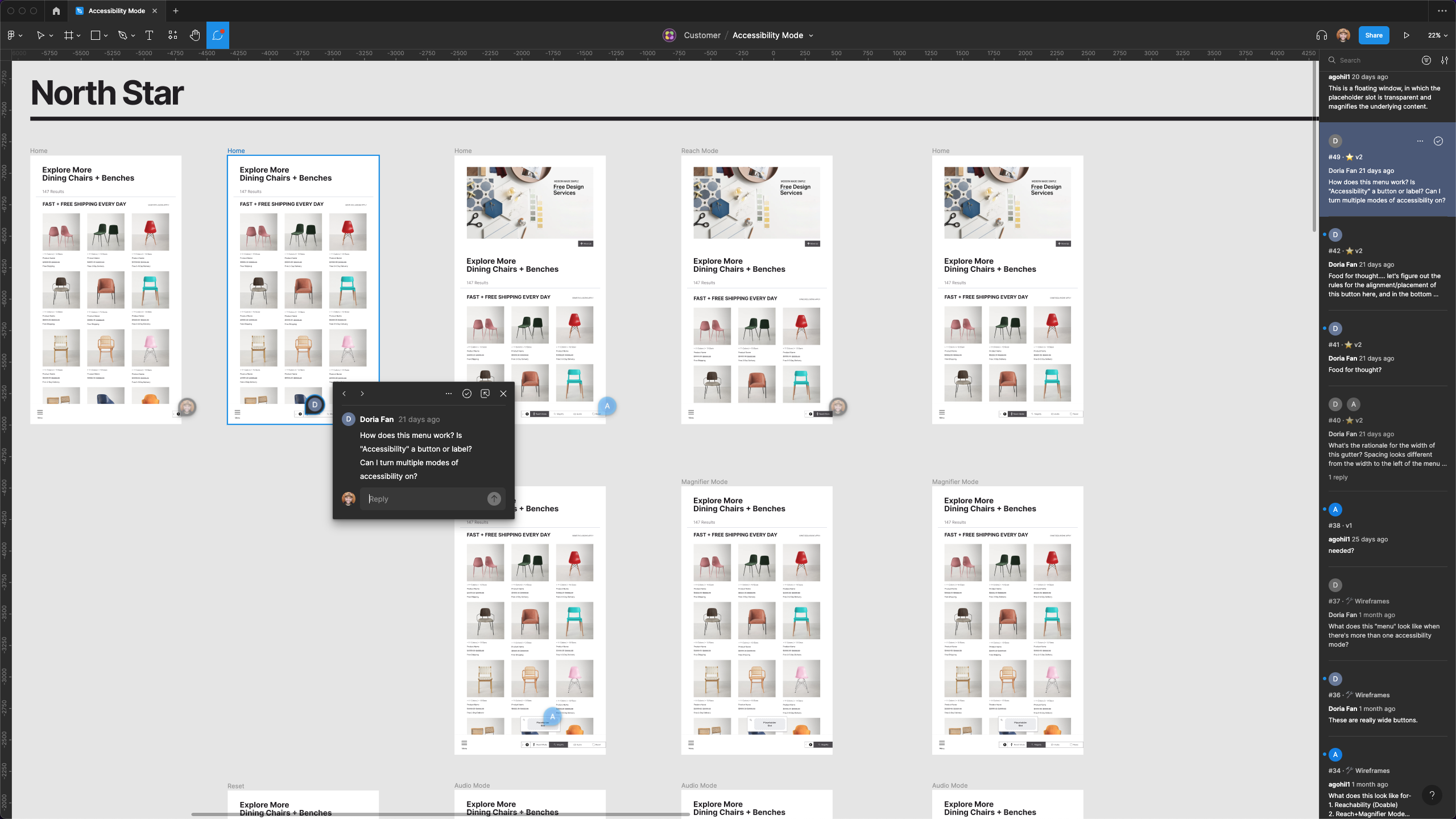
Accessibility Mode as a feature for interactive screens was a product of contextual inquiry. It was identified in the early stage of the project, that allowed me to introduce and advocate for accessibility within the Physical Retail team.
Designing strategy for a phased project
Understanding how to strategize for a slowly evolving project, and designing versions that evolve with the project provided an insight into thinking of the big picture goal while iterating through my work.
Wayfair: Store Locations
Designing a web and app experience for Wayfair customers looking to shop in-store. (View here)
The Ask
In 2022, Wayfair was launching physical retail stores for their Specialty Retail Brands.
How might we design a customer experience that organises and shows all retail locations?
Timeline
June-July 2022
2 months
Project Team
Ashesh Gohil
Carina Ensminger
Evan Cooke
My Role
Content Strategy
Visual Design
Wireframes
Interaction Design
UX Design
UI Design
At a glance
Wayfair opened its first store in 2022. Their aim was to enable online shoppers to shop in-person. Each store will have an individual retail location page. As they open more stores, customers would need to find and see all store locations. The store locations experience would enable the customers to view and visit the store locations.
How do we design the store directory to evolve as Wayfair opens more stores in the next few years?
How do we design the store directory to evolve as Wayfair opens more stores in the next few years?

Process
Key Research Findings
The project for creating a store directory started with a competitive audit performed by the UX Research team. Prior to the audit, the team identified a key challenge -
“How do we make store locations discoverable for customers across our digital experiences as we scale?”
The goal for the competitive audit was to
- Identify how retailers showcase their locations across web and app experiences
- Uncover themes in the features and functionality of these experiences
- Use the findings to draft a scalable plan for Wayfair’s store opening
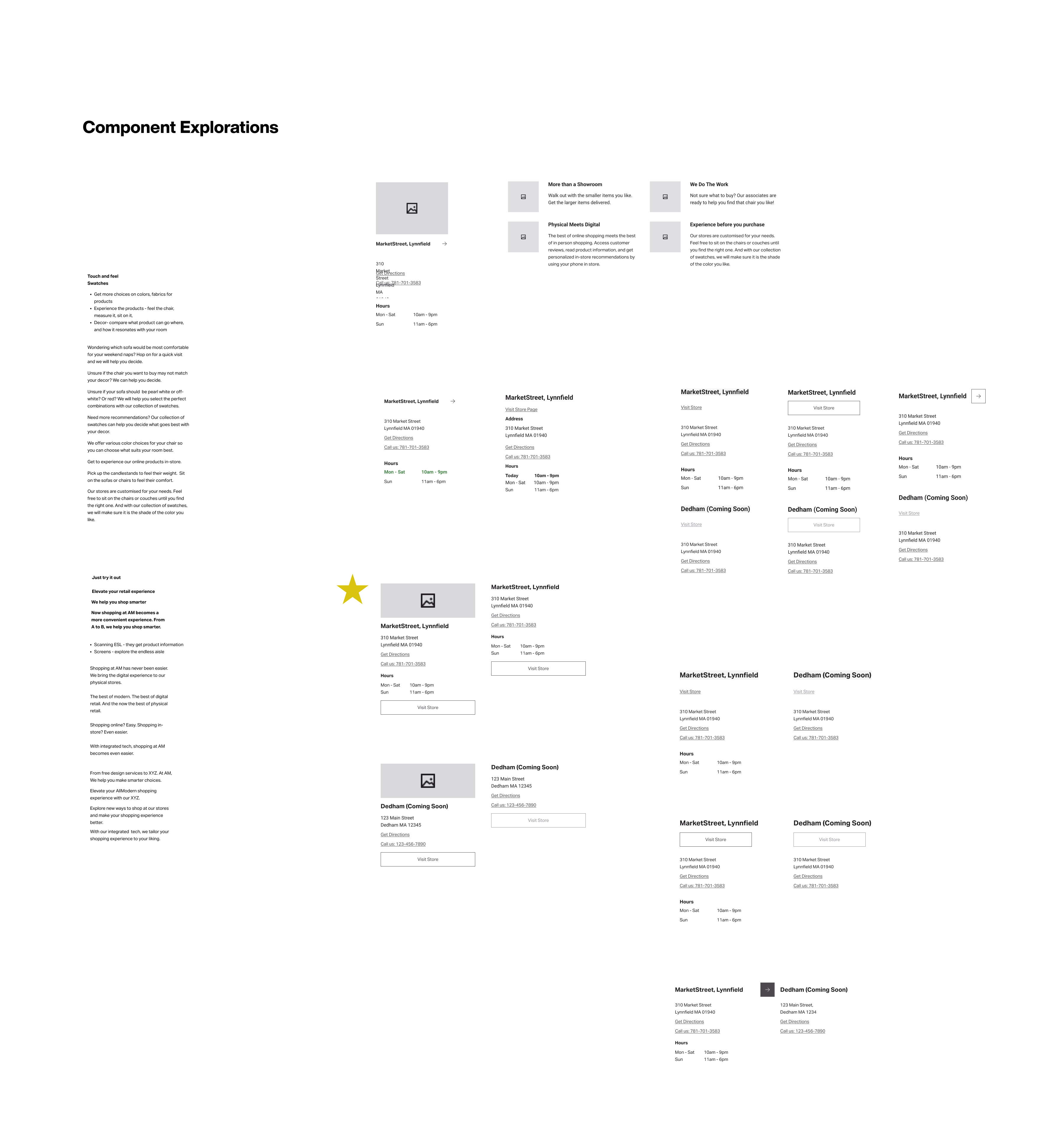
The audit uncovered three different types of experiences that helped users find individual stores. These three experiences helped establish the long-term goal for Wayfair’s first store, along with their Specialty Retail Brand, AllModern. The experiences were as follows-
- Store Locations - A simple page that lists out all store locations with their addresses and contact information, normally arranged in cards or content blocks. Common for retailers with 15 or fewer locations.
- Find A Store - An experience that provides a user with a way to search for a store near them, generally by zip code and on a map. Filters are also widely used in these experiences. Common for retailers with 50 or more stores.
- Store Directories - A navigable list of hyperlinks that take a user to individual store pages, generally organized by state/ region. Common for retailers with 50 or more stores.
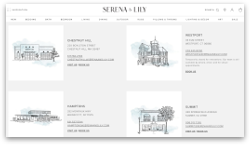
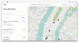
While “Find A Store” and “Store Directories” were common for retailers with more than 50 stores, “Store Locations” was common for stores with less than 15 locations. As Wayfair was looking to have less than 15 locations in the near future, we decided to go forward with creating such an experience.
Ideation
The goal with the initial sketches would be to showcase the progress of the Store Locations Page as Wayfair scales up from 2-15 stores. With initial sketches it became easier to identify what points of entry could be considered. Additionally, we also brainstormed on what empty states could look like, for new store launches.
Wireframes
Beginning with handmade sketches and transitioning to blockframes was useful in understanding how the content should be laid out for the Store Directory. Once the content heirarchy was established, the blockframes were referenced to create more detailed wireframes.
Each point of entry was considered based on the platforms available.
One of the challenges was to identify how to present the different value propositions of AllModern, the Specialty Retail Brand for which Wayfair launched the first store.
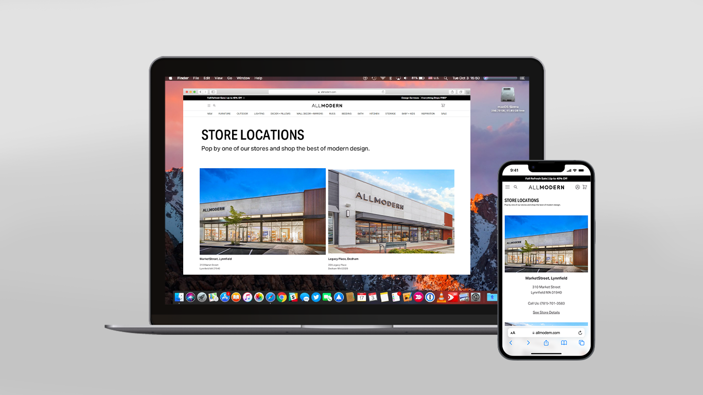
Final Mocks
The webpage shows the store locations and displays how it would be to shop within a store. Additionally, it links to the design services webpage and other brand stakeholder propositions.
MWeb & App Experience
Although the MWeb + App experience is similar, the app offers a link to enhance the user's in-store experience by asking for an access to the user's location.
Takeaways
Working within a Design System
Using Wayfair's existing Design System, Homebase, was critical in understanding how to design within an existing design system without proposing new components.
Designing strategy for a phased project
Understanding how to strategize for a slowly evolving project, and designing a version that evolves with the project was a great learning experience.
Wayfair: Quotes Generation Tool
Streamlining quotes generation process for associates at Wayfair

The Ask
The existing version of the tool affected the associate’s workflow efficiency by taking them through an internal tool and slowing the associate’s process by 80%.
How might we make the quote generation process easier for the associate?
Timeline
August 2022
2 weeks
Project Team
Fred Carriedo
Ashesh Gohil
Allie Landry
Muhammadh Riyadh
My Role
Visual Design
Wireframes
Interaction Design
UX Design
UI Design
Problem
As a store associate, I need to be able to quickly generate a quote for a customer, so that I can make their visit easy and seamless and have them leave the store feeling confident in their purchase
At a glance
The Quotes Management tool would take the associate through another internal tool, Admin Home, while generating a quote for the customer.
This creates pain points for associates and customers-
This creates pain points for associates and customers-
-
Associate takes more time to create the quote, and required access to customer’s personal email (presenting a security risk for the customer)
.
- Customer needs to verify within the process and ensure that they have received the quote.

Process

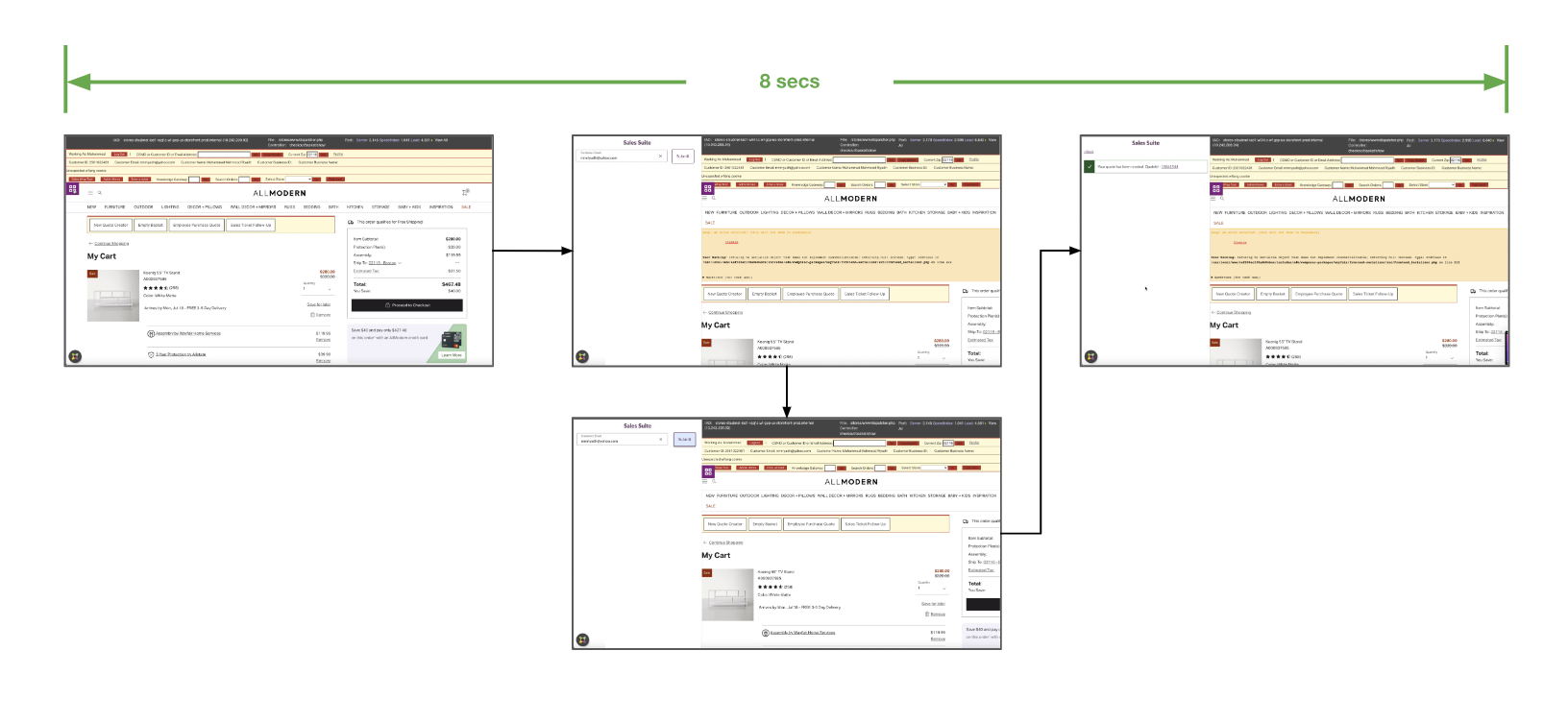
Streamlining
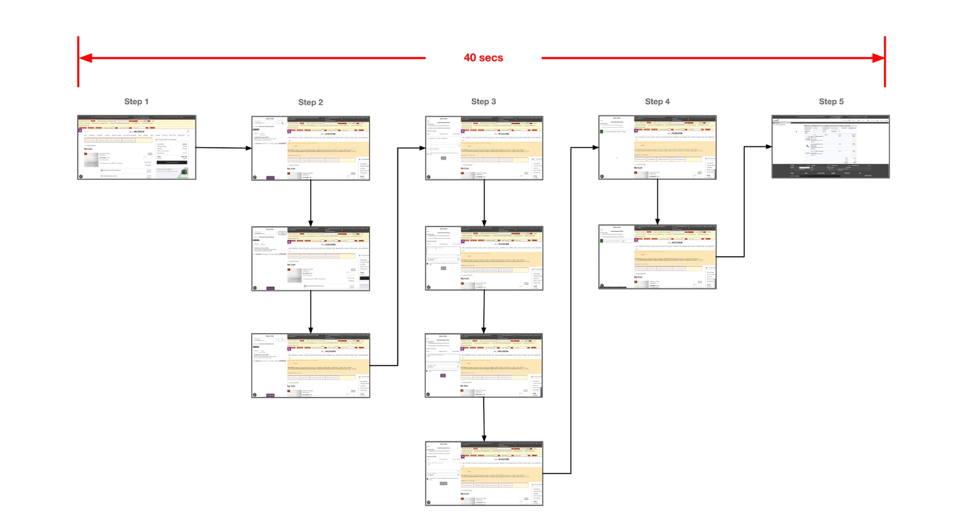
Before streamlining the tool, the quotes generation process took 5 steps with an average time of 40 secs.
Impact


Takeaways
Working within a Design System
Using Wayfair's existing Design System, Homebase, was critical in understanding how to design within an existing design system without proposing new components.
Designing strategy for a phased project
Understanding how to strategize for a slowly evolving project, and designing a version that evolves with the project was a great learning experience.
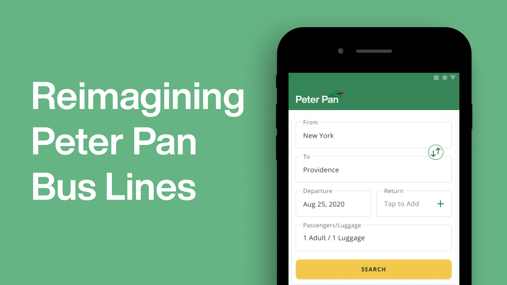
Peter Pan
Reimagining the interface for Peter Pan Bus Lines
PROBLEM
As a frequent traveler, I have used Peter Pan Bus Lines countless times. I decided to redesign their mobile application to align their services with their customer experience of using Peter Pan.
TIMELINE
Summer 2021
4 weeks
PROJECT TEAM
Ashesh Gohil
MY ROLE
User Research
Visual Identity
Interaction Design
Getting Started
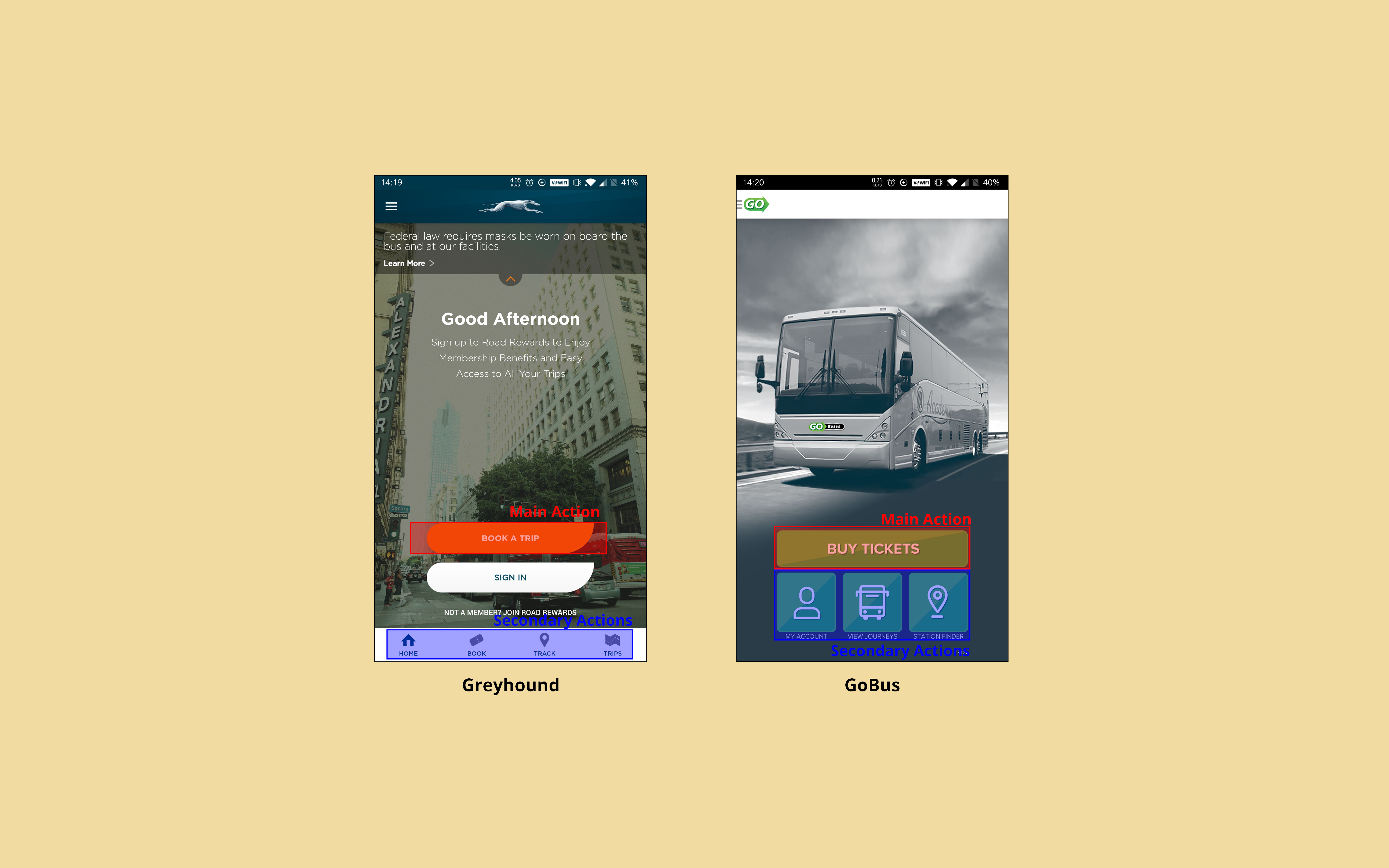
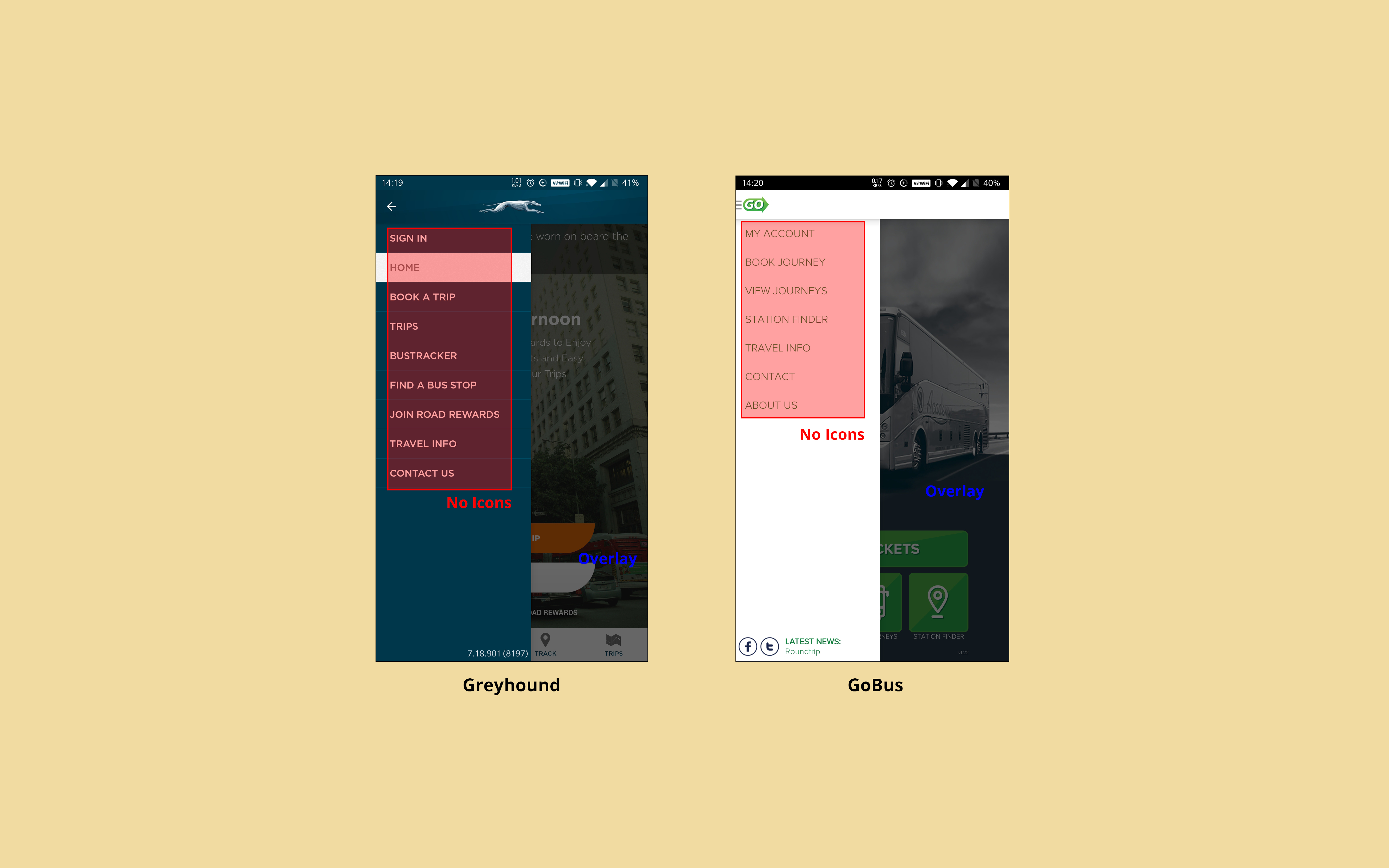
The old Peter Pan app experience felt dated and generic. The disconnect between the customer experience of the Peter Pan Bus Lines and the mobile platform indicated a need for an overhaul in its digital experiences.
Identifying actions & elements of competitor products
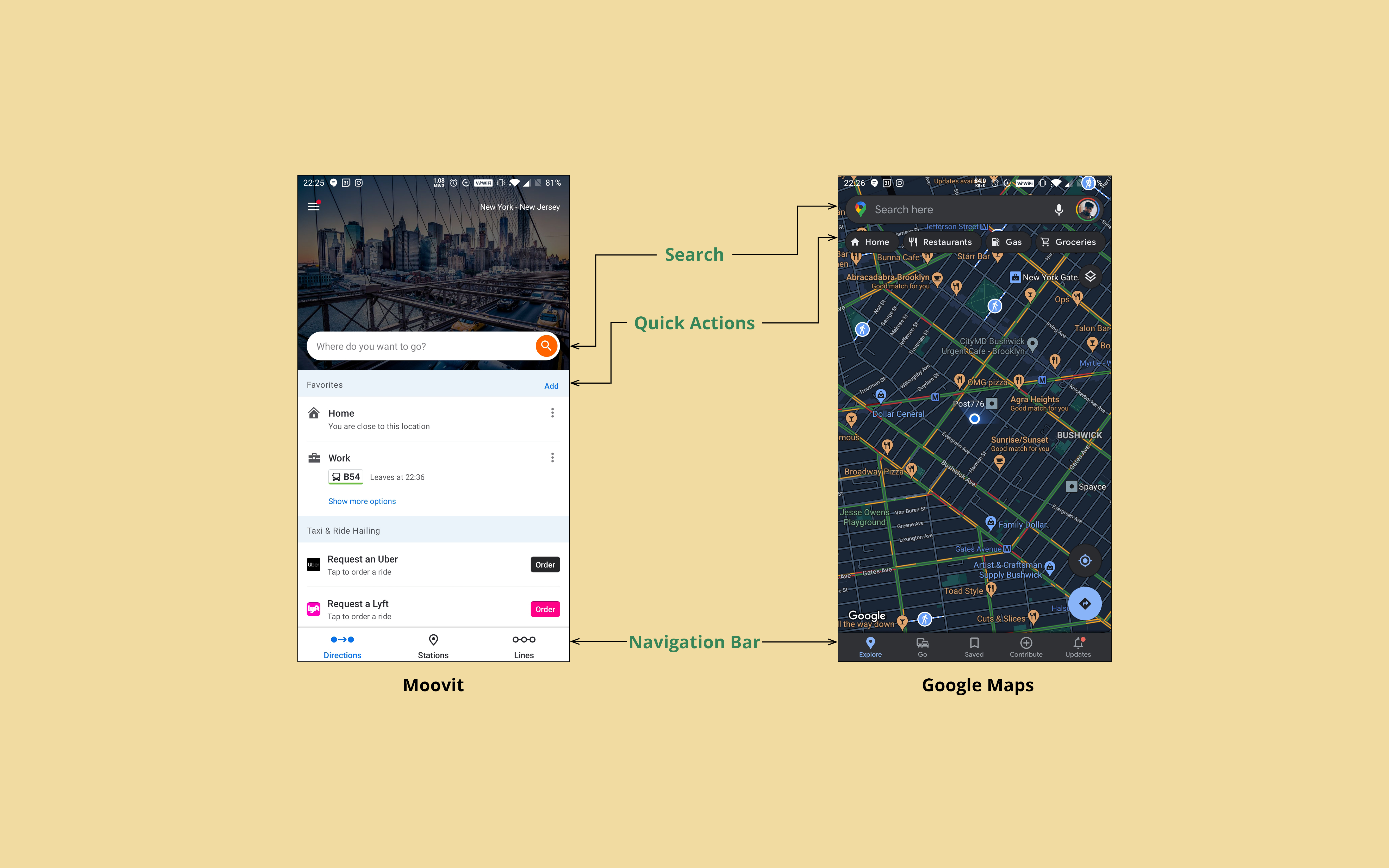 Key UI elements in Moovit & Google Maps
The common features within these applications helped create an effective framework for the app based on ease of use and navigational efficiency. The UI needed to be clean and direct. And the users should spend less time figuring out how to navigate the application, in order to quickly book their tickets, or find old trip details.
Early Information Architecture & Navigation
After an extensive UI and user flow audit of the existing Peter Pan application, I found that the workflow needed to be reorganized and streamlined to improve the navigation.
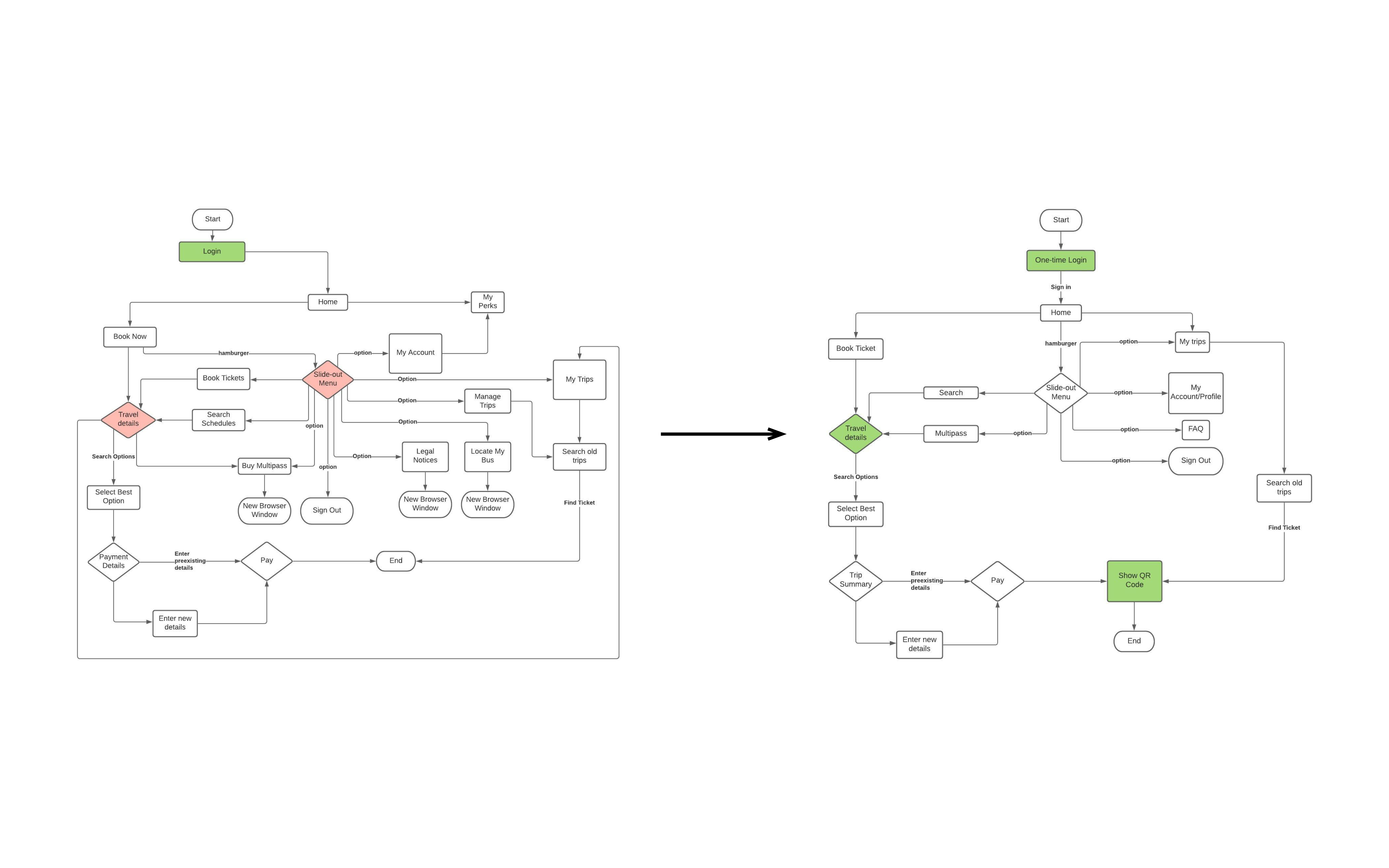 Streamlined workflow to improve user navigation
The core experience was simplified into three sections: the ticket booking process, the user profile, and the trips section with past and upcoming travel details.
Key Information Architecture & User Flows
I tested out the screen flows using paper prototypes with a few users who had used Peter Pan. Some users were instructed to perform the task of booking a ticket, while others were instructed to also verify their trip details. For both tasks, the users were told to talk about their thoughts as they navigated the prototype.
User 1
- Confused by the back arrow present on the confirmation screen.
- Was not able to see the details tab clearly.
- Wanted to see the older trips as soon as he opened the app.
User 2
- Thought the recommendation tab was redundant.
- Confused by the details on the checkout screen.
- Wanted an option for downloading PDF ticket due to familiarity.
User 3
- Wanted the trip details screen to be replaced with a popup to make it more intuitive.
- Questioned the position of the menu for a large screen phone.
- Wanted to know the nearest stop from their home.
Information Architecture Modification
After gathering the user feedback, the workflow was modified to include some user suggestions as well as pain points observed in the Wizard of Oz tests.
The navigation process was further simplified into two activities-
The navigation process was further simplified into two activities-
- Primary Activity which involved the entire end-to-end ticket booking process.
- Secondary Activities which involved the trips, locations, user profile and additional information related to the app.
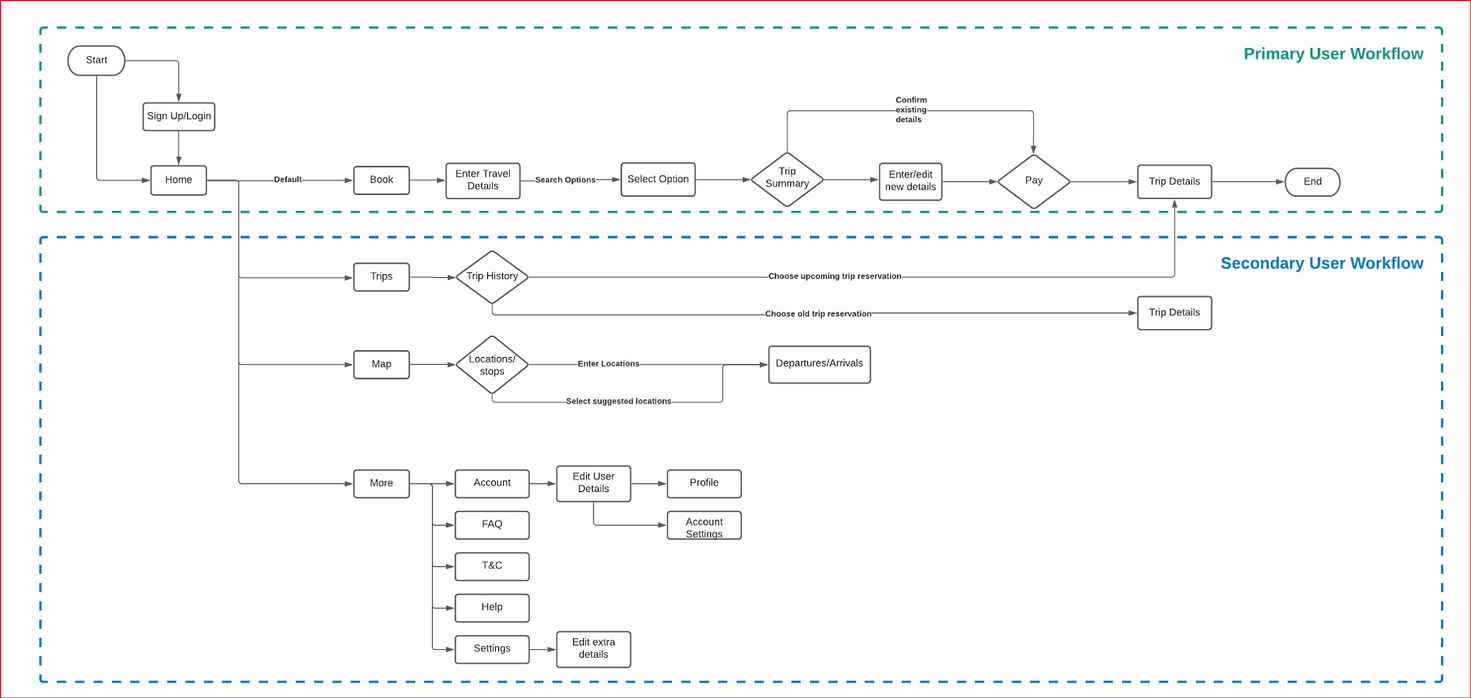 Workflow breakdown to prioritise user screens
Final Design
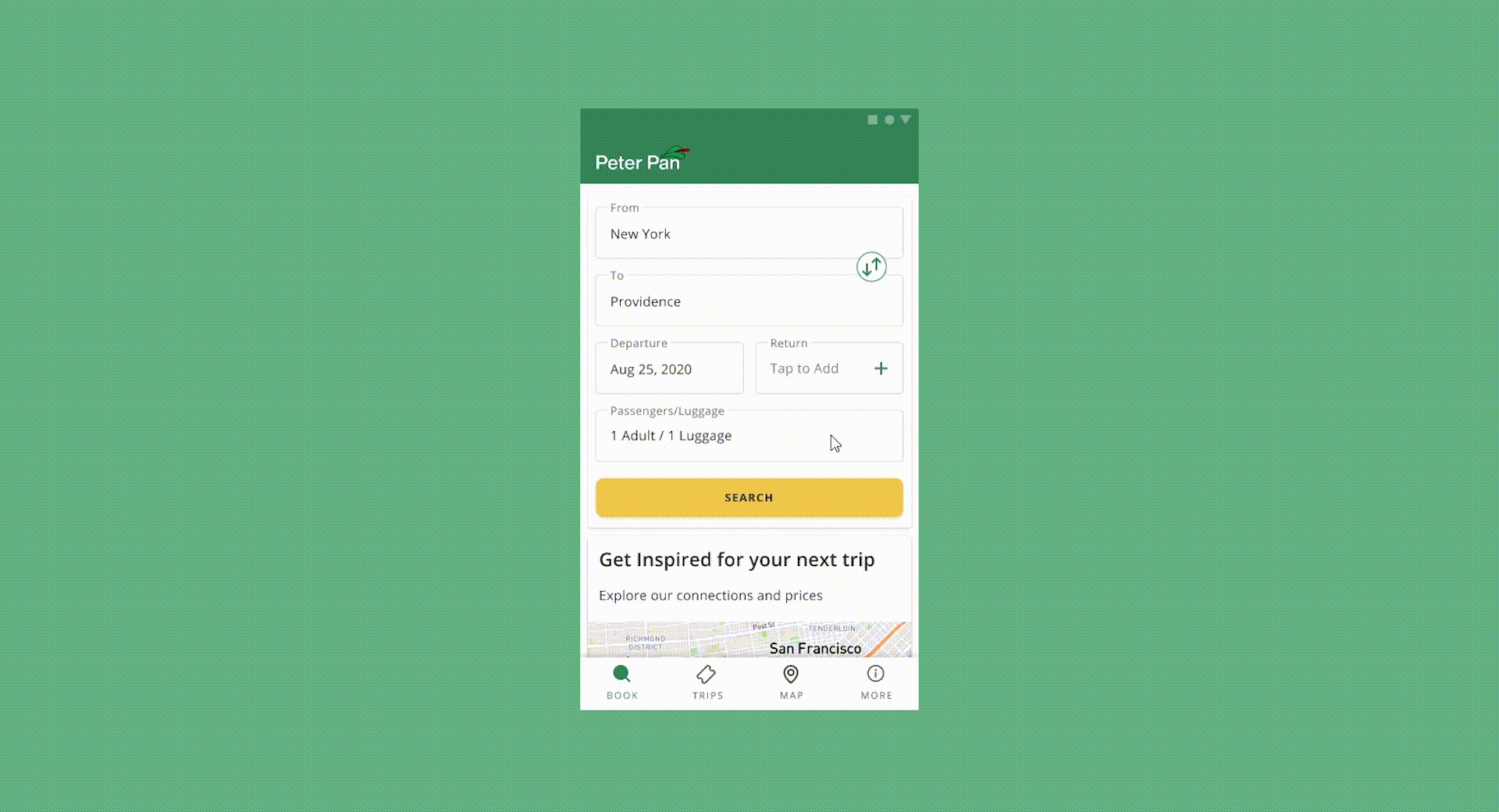
One of the challenges was to present the necessary information without overwhelming the user. The lists were changed to a card-based format for better hierarchy, improved scannability and information recognition.
 Improved UI for the primary user workflow
The hamburger menu was replaced by the bottom navigation bar for ease of navigation and better content structure. Additionally, the More section was added to help the user edit personal information or address any queries or questions about the app.
 Redesigned bottom navigation bar for secondary user workflows
Remote user testing
HYPOTHESIS
The first-time user will easily identify the desired location and select the option from provided list rather than inputting the location. They will look at the trip details before booking their journey.
The user will only glance at trip confirmation options and scroll for other details about the journey.
The complete time taken by the user will be approx 2-3 mins to complete the task of booking a trip.
The user will only glance at trip confirmation options and scroll for other details about the journey.
The complete time taken by the user will be approx 2-3 mins to complete the task of booking a trip.
MAIN TASK
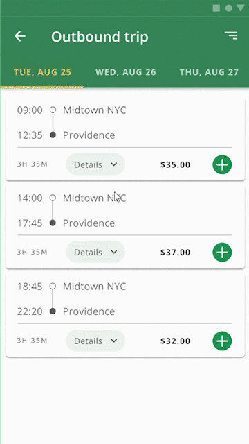
The task is to successfully book a trip from New York to Providence as a first-time user of Peter Pan Bus Lines.
SUB TASK
Feedback & Metrics
The users spent more time on subtask 1 which indicates that it was not intuitive. The users also spent less time on subtask 2 which affirmed the hypothesis. All the users spent around 3 mins completing the main task which affirmed the hypothesis.
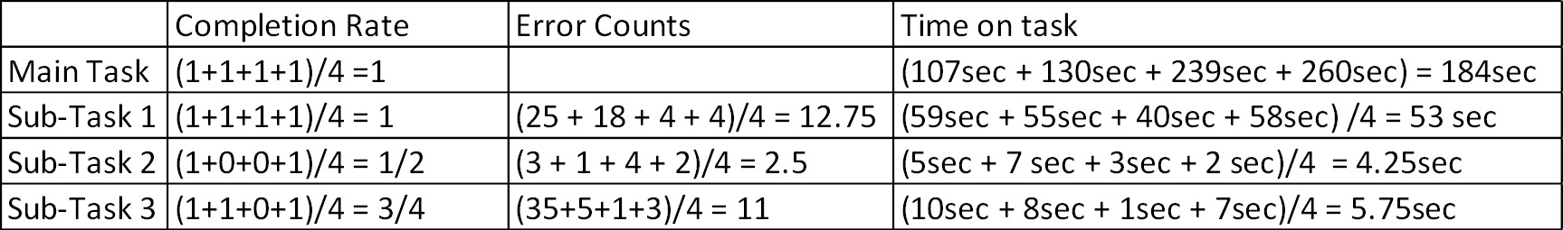
CONCLUSION
- The users felt more stuck at subtasks 1 and 2
-
The misclicks for subtask 1 were around 66%
-
Users were confused while selecting details
Improvements
Based on the feedback, the details component was one of the problem areas. Users preferred details in card interaction over the alternatives, as seen below
 Details
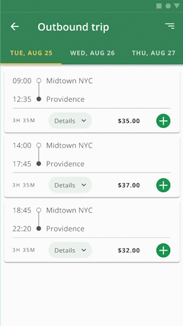 Card
Card Details in Card
Takeaways
CREATING A DESIGN SYSTEM FROM SCRATCH
This redesign of Peter Pan's mobile app includes a design system to help prioritize user workflows over visual design.
REMOVAL OF SUPERFLUOUS COMPONENTS
Having a card-like visual system helped simplify the necessary content for the user.
PRIORITISING INTERACTIONS OVER SCREENS
User testing with metrics provided insight into how to improve component interactions rather than adding additional screens.
Signal Wallet
A concept app feature to help you split the bill with friends
The Ask
Social Outings always come with a tricky social dance around how to split the bill. I was tasked with creating a user experience for peer bill splitting as part of a design exercise
Timeline
January 2020
2 weeks
Project Team
Ashesh Gohil
My Role
User Research
UX Design
Interaction Design
Problem Segments
Lack of Transparency
Users needed to confirm if they were giving or receiving the right amount of money
Fragmented Experience
Users switched between 2 or more apps like Venmo and Whatsapp to calculate, communicate and pay.
At A Glance
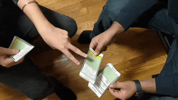
As we look at managing our expenses better, how might we enable users to ensure that their expenses are settled in the least amount of time?
 User demonstrating how they use Venmo to split bills
Strategy
Why Signal?
Signal is a more secure end-to-end encrypted platform compared to its popular alternative, Whatsapp. Creating a payment channel within a messaging service aligns with the user flow and needs.
Signal Wallet was based on the existing design system of Signal. It was important to match the mental models for onboarding existing users of their product ecosystem.
Prototyping
Information Architecture & User Flow
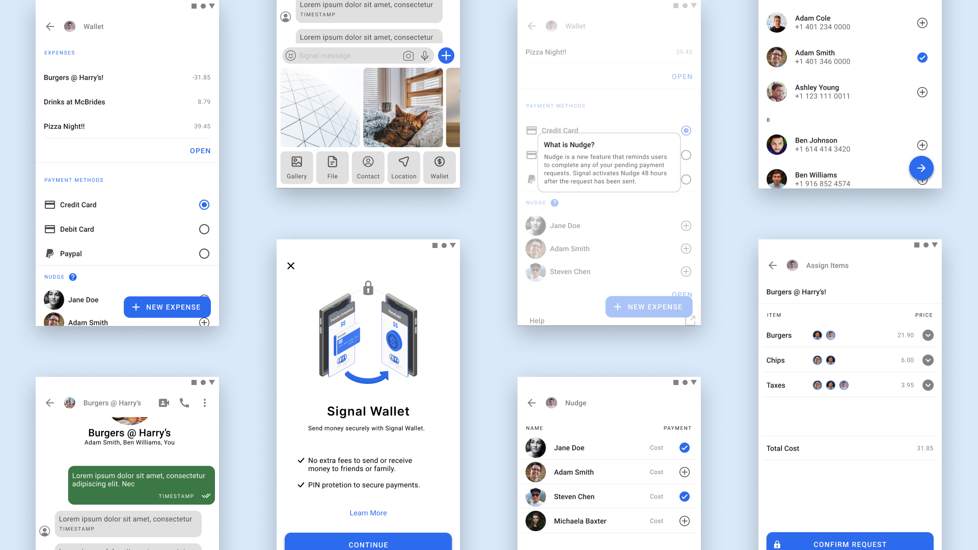
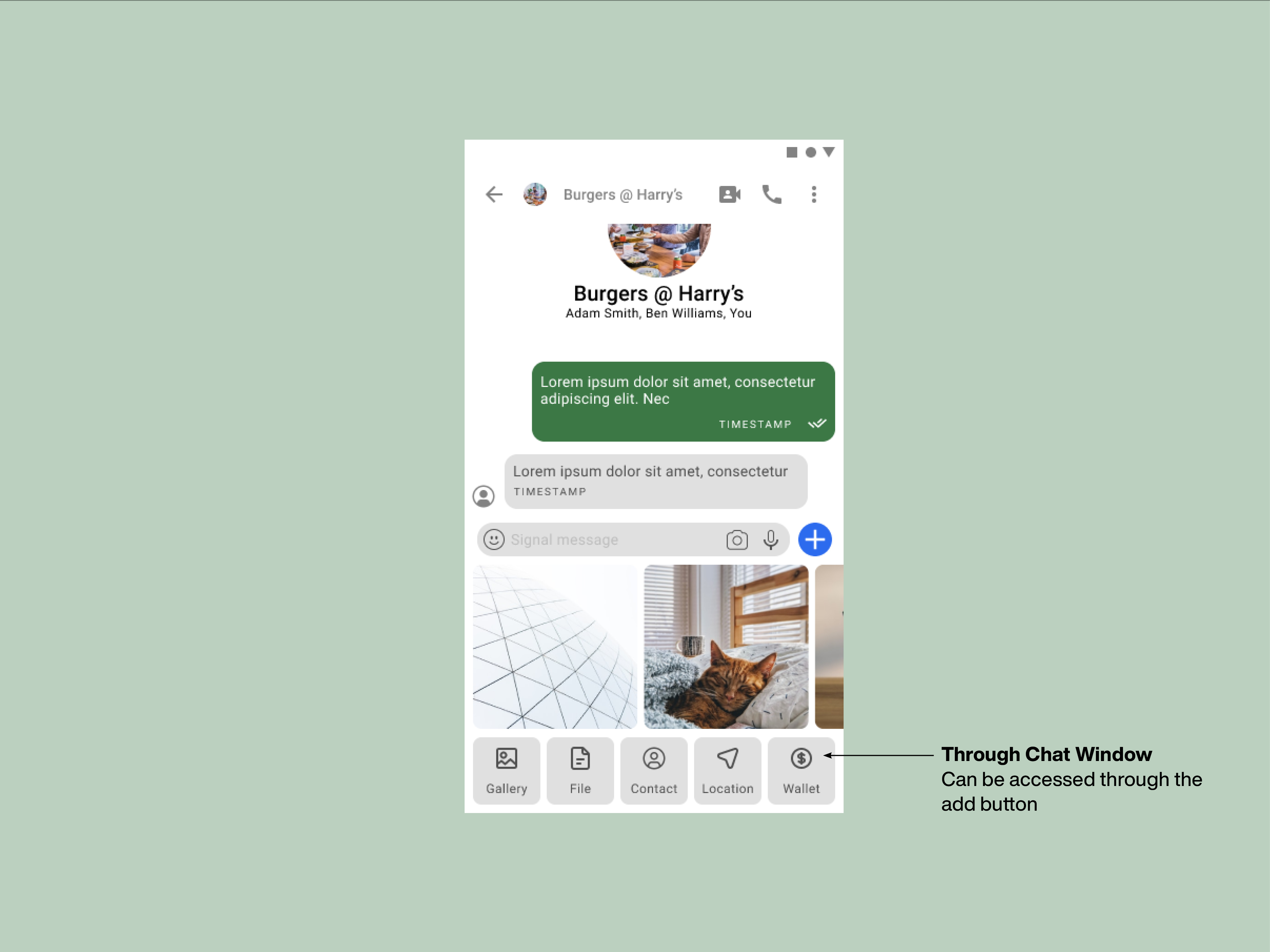
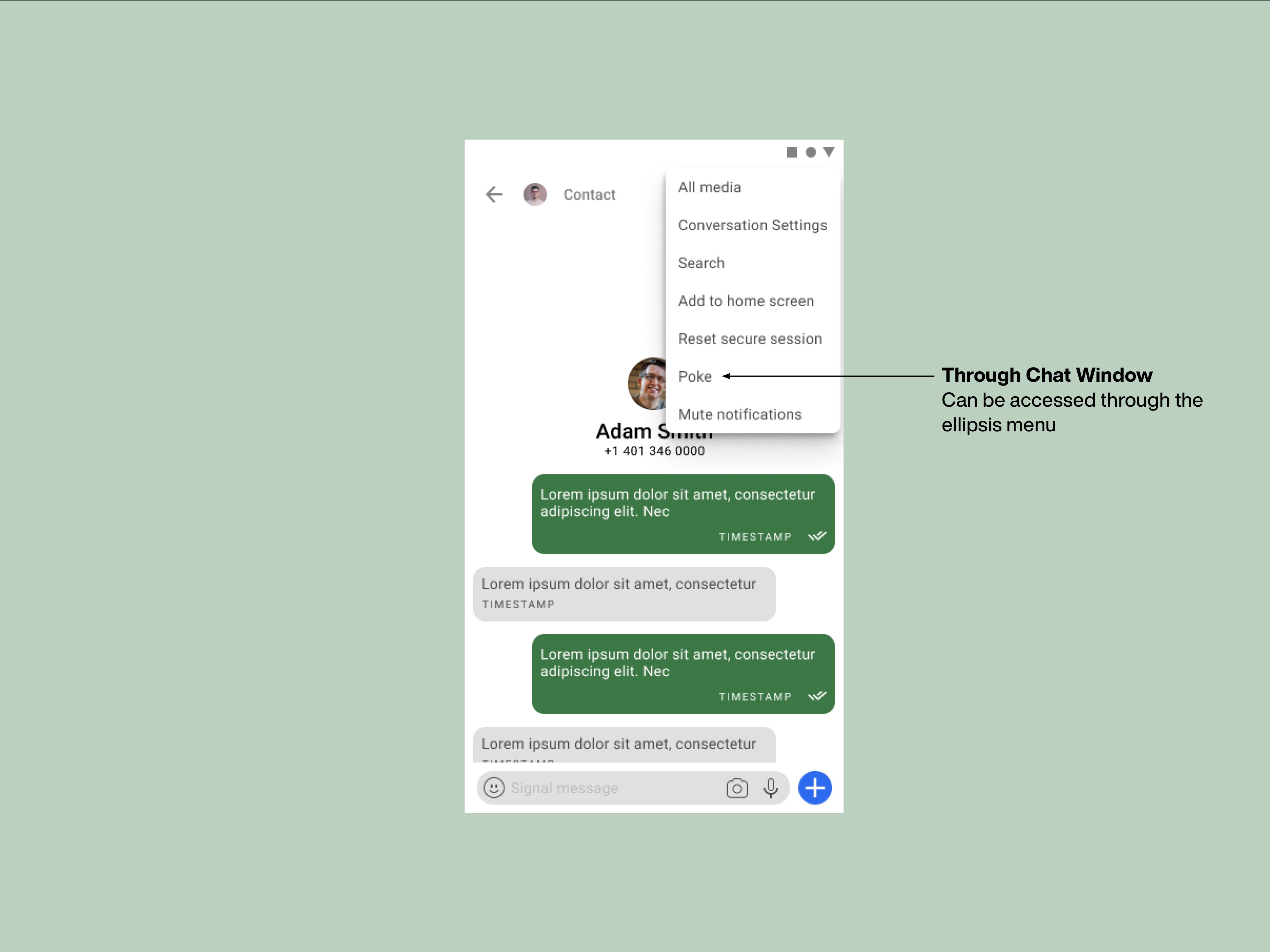
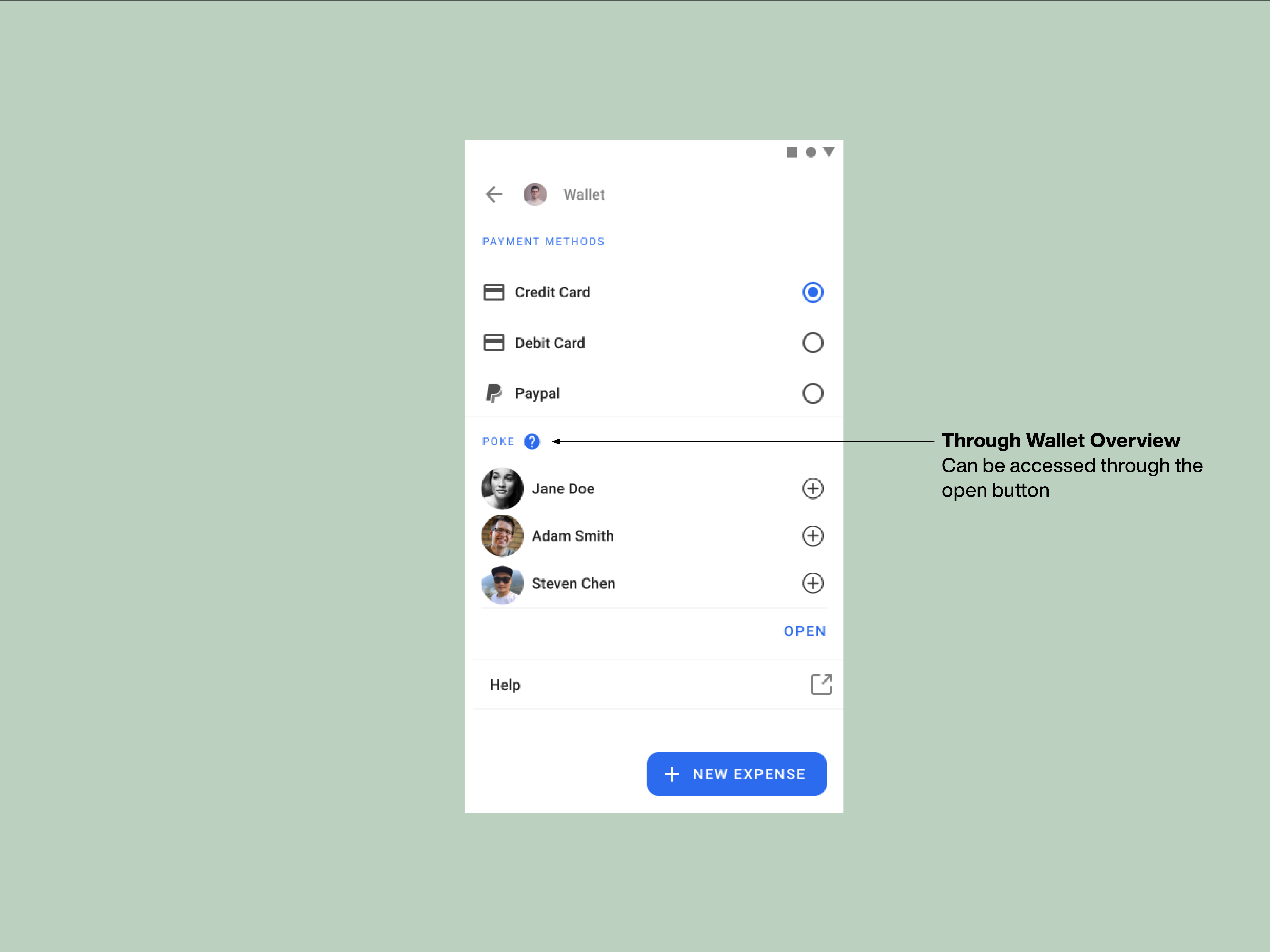
The wallet can be accessed through the chat attachment option in the communication thread. It is integrated within the core app and is also accessible from the settings list menu on the home screen.
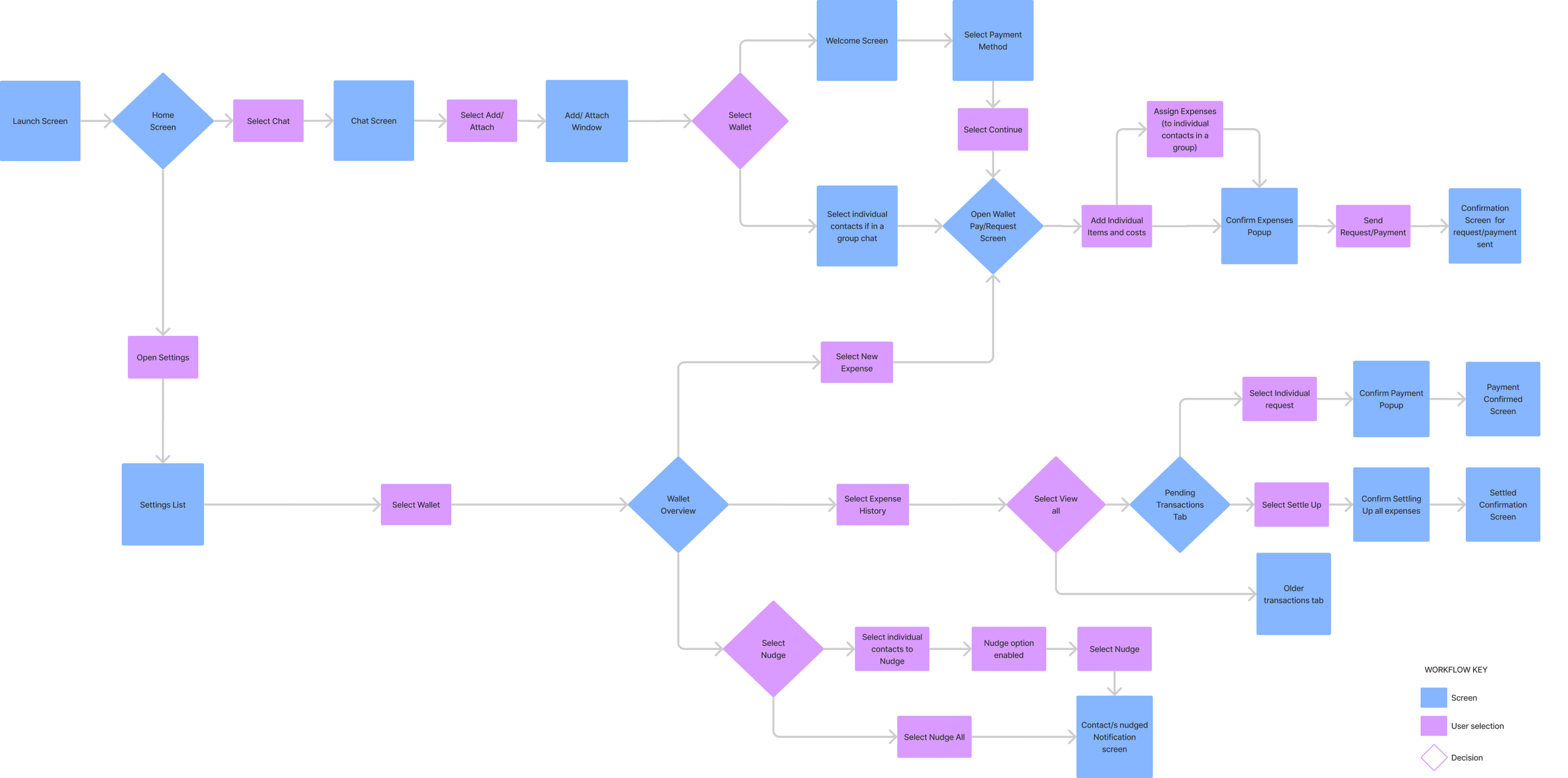
Accessing the wallet through chat allows for more direct payments, while the settings menu directs to an overview of past transactions along with Pay and Request options.

One of the challenges was the overview screen. I explored different formats and decided on retaining the key UI elements from Signal's chat threads for uniformity.
Features
Manage your bills easily
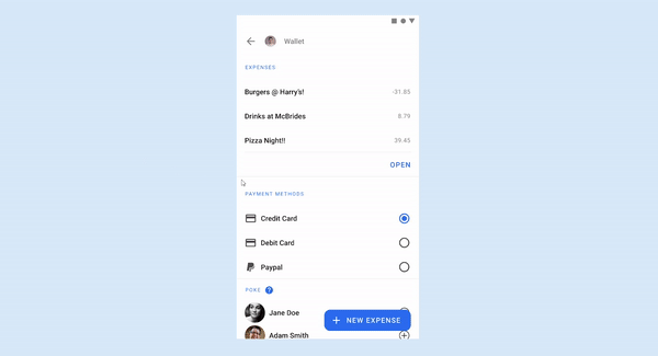
The wallet home screen contains a list of the user's expenses and payment methods. It also contains a list of people who have not completed their payment requests, classified under nudge.

Making & Sharing Bills
The user can add the bill details and then choose existing contacts to split the bill. A quick competitive audit of apps where the social invitation was also a central feature inspired the UI designs for this view.

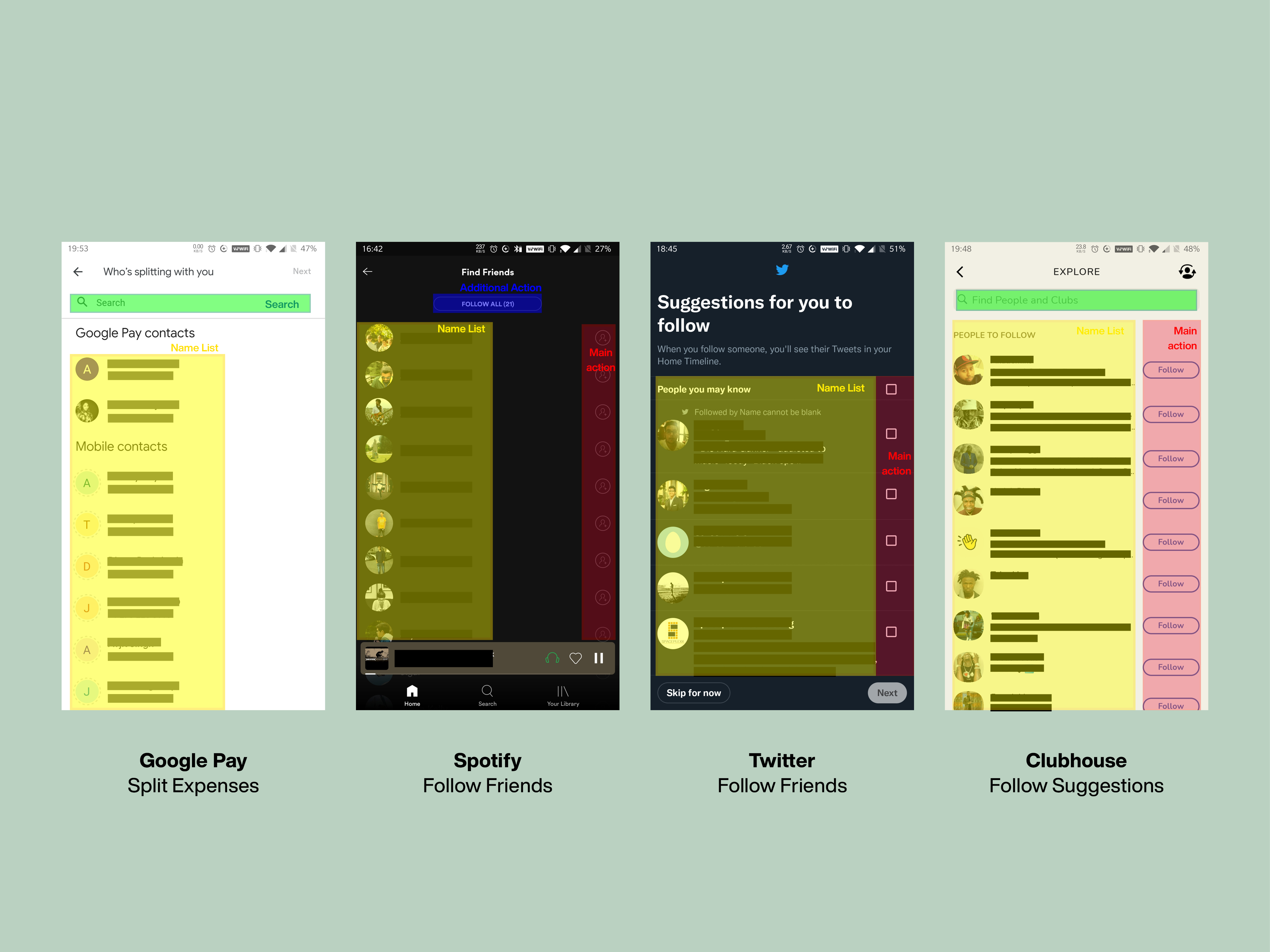
Analysis of "Add Contacts" pages from similar applications helped define the structure.
The host can then assign items to guests accountable for paying them. Separating assignments from the direct contact selection allows the app to accommodate more complex kinds of splitting that are likely use cases, such as multiple guests sharing one item.
Payment Reminders Simplified
Nudge is a feature that reminds users to complete their pending payment requests. It can be accessed through the Wallet menu list or the private chat thread.
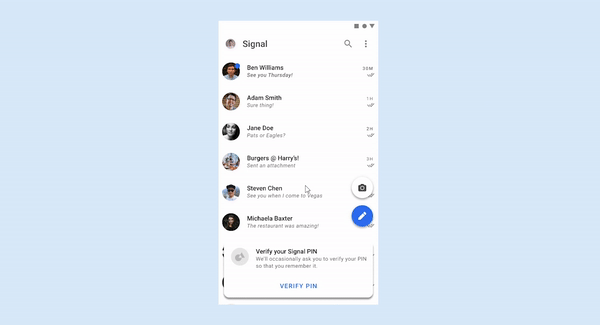
Nudge sends friendly reminders to users through notifications or in-text pop-ups.
Remind users to pay by Nudging them
Takeaways
Using a design system
Using adapted versions of Signal's design system to make the app look and feel like it is a part of their product offerings.
Designing for a specific task
Signal Wallet was tailored around the specific circumstances of food bills. But with more time, I would have designed context-specific experiences for other use cases.