Peter Pan
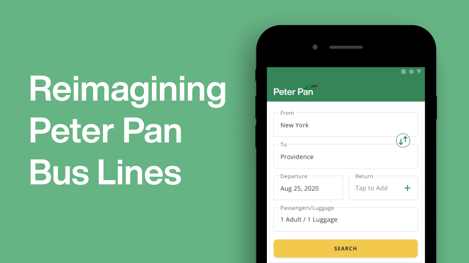
Reimagining the interface for Peter Pan Bus Lines
PROBLEM
As a frequent traveler, I have used Peter Pan Bus Lines countless times. I decided to redesign their mobile application to align their services with their customer experience of using Peter Pan.
TIMELINE
Summer 2021
4 weeks
PROJECT TEAM
Ashesh Gohil
MY ROLE
User Research
Visual Identity
Interaction Design
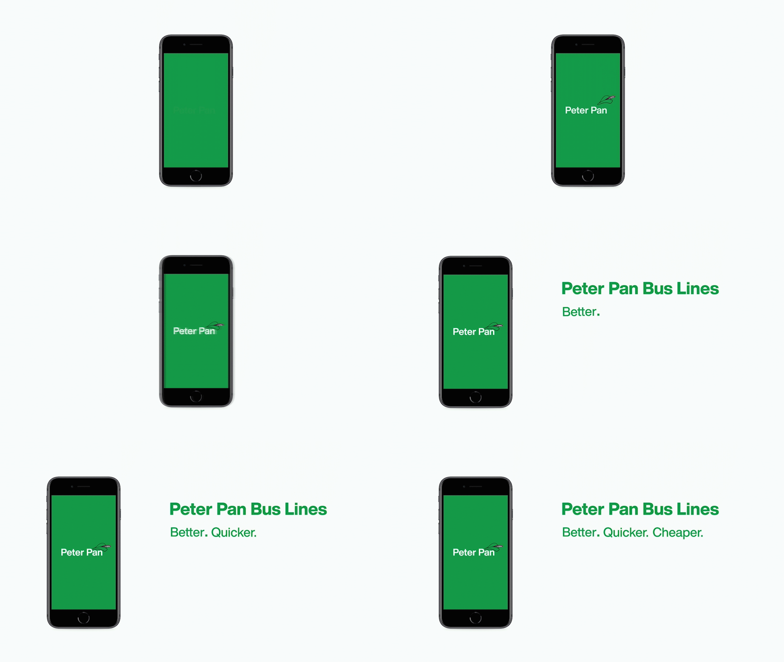
Getting Started
The old Peter Pan app experience felt dated and generic. The disconnect between the customer experience of the Peter Pan Bus Lines and the mobile platform indicated a need for an overhaul in its digital experiences.
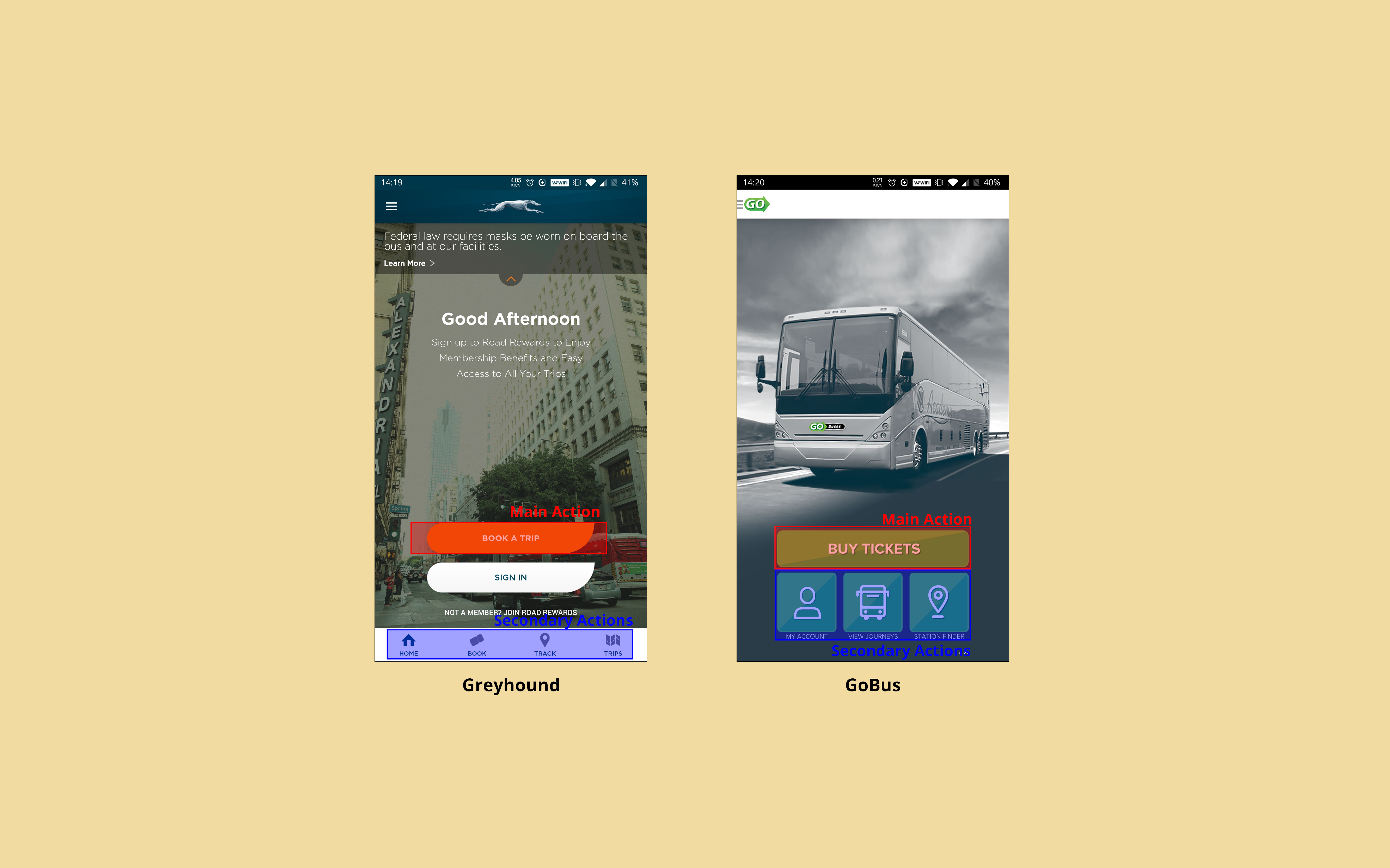
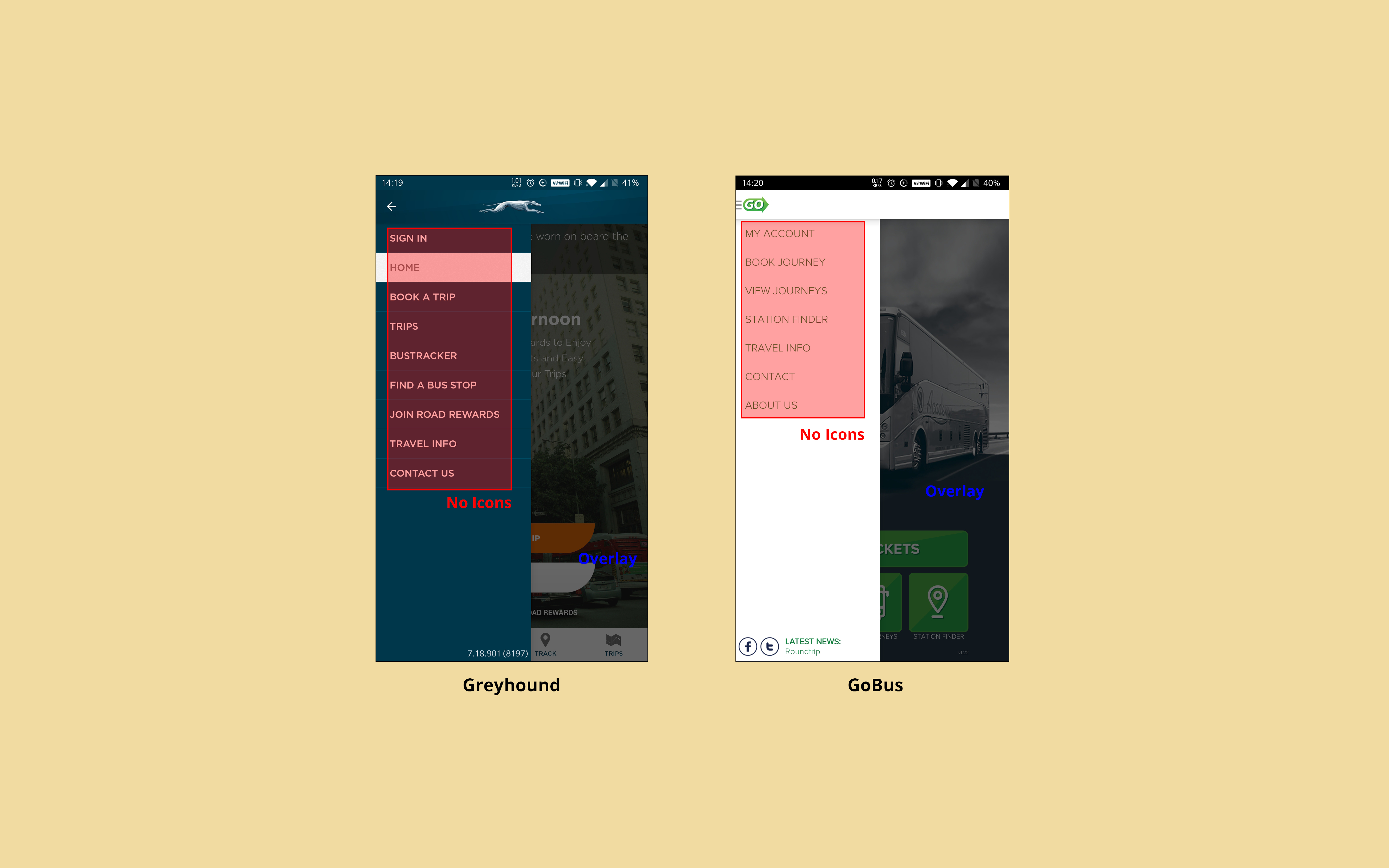
Identifying actions & elements of competitor products
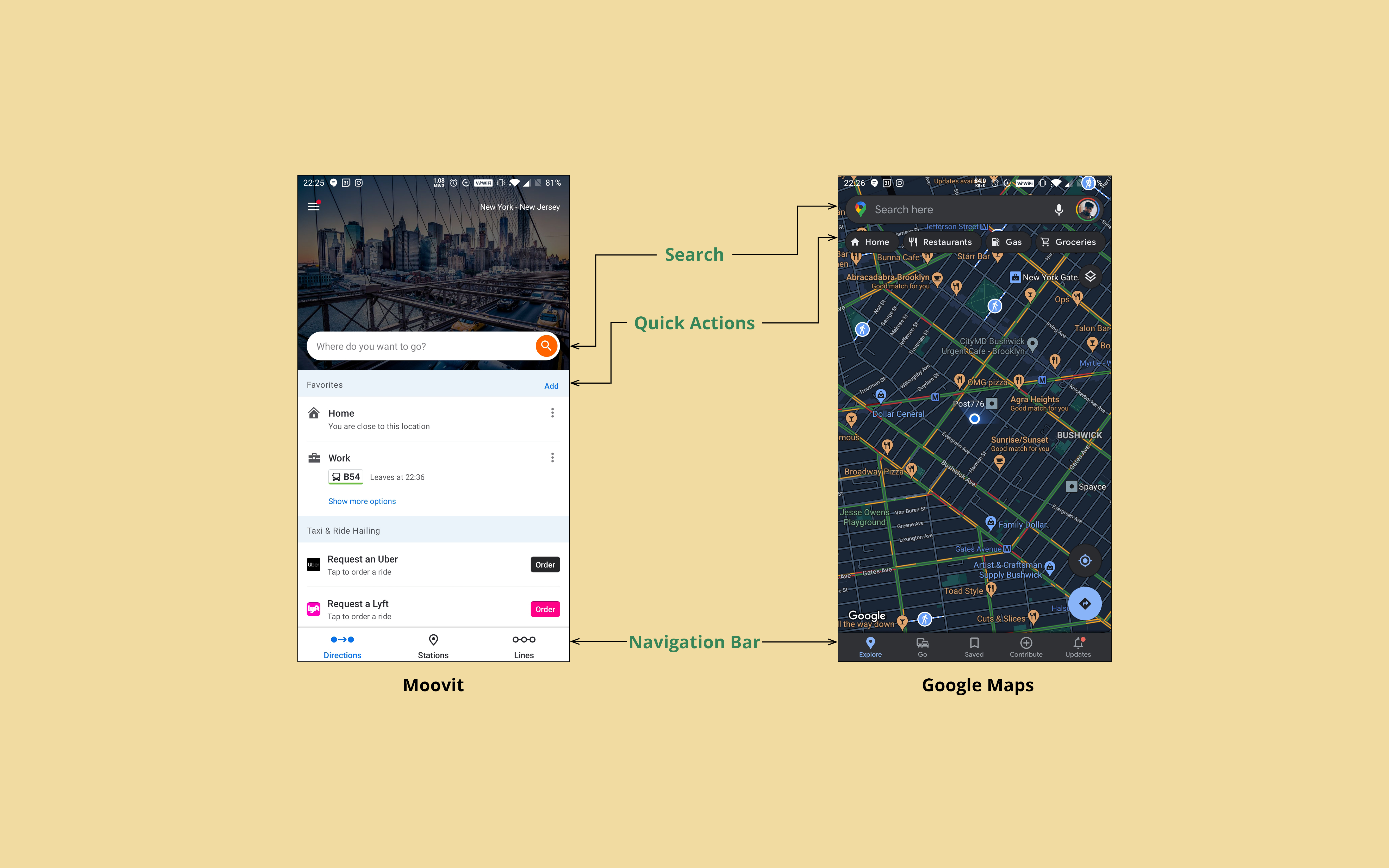 Key UI elements in Moovit & Google Maps
The common features within these applications helped create an effective framework for the app based on ease of use and navigational efficiency. The UI needed to be clean and direct. And the users should spend less time figuring out how to navigate the application, in order to quickly book their tickets, or find old trip details.
Early Information Architecture & Navigation
After an extensive UI and user flow audit of the existing Peter Pan application, I found that the workflow needed to be reorganized and streamlined to improve the navigation.
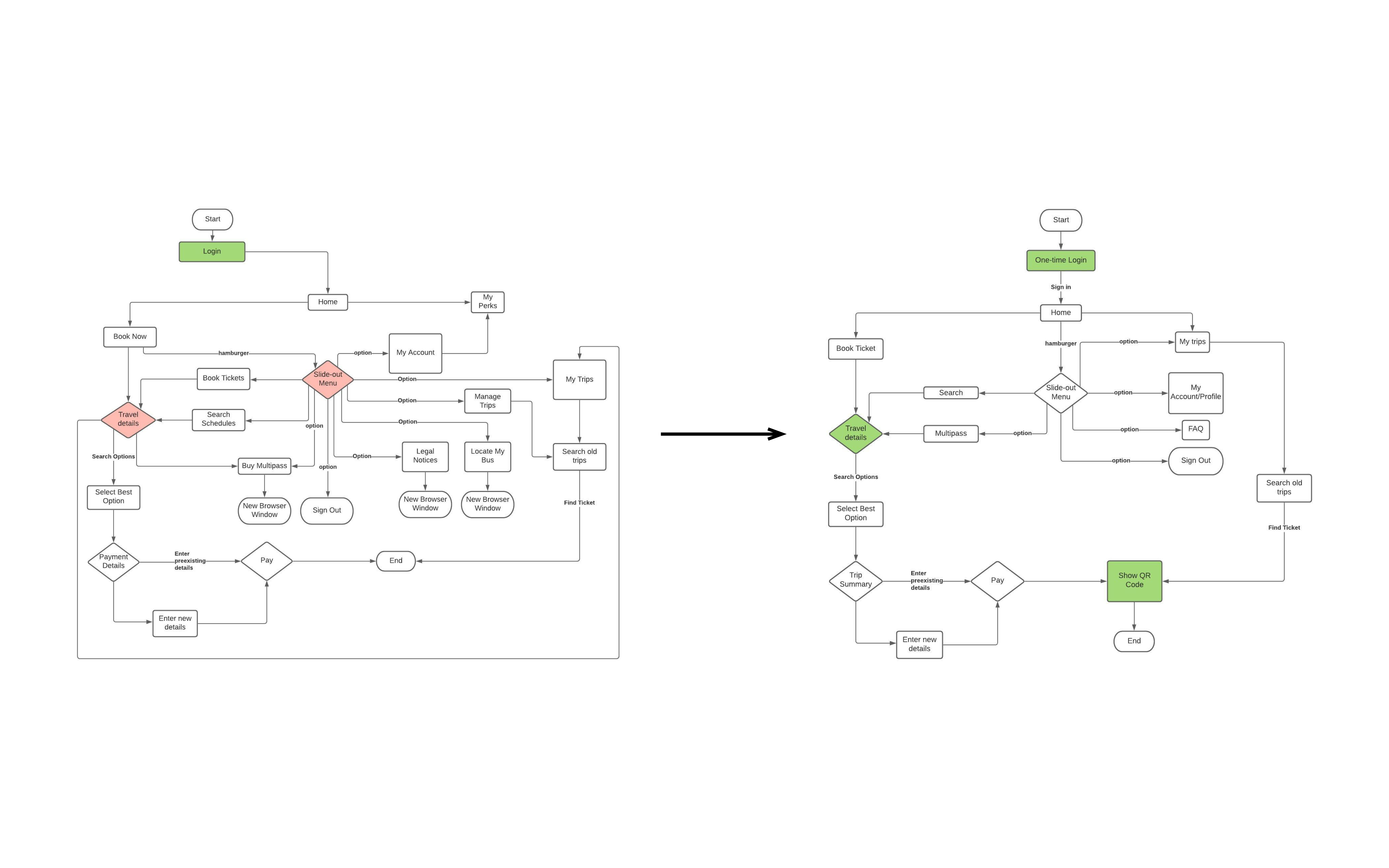 Streamlined workflow to improve user navigation
The core experience was simplified into three sections: the ticket booking process, the user profile, and the trips section with past and upcoming travel details.
Key Information Architecture & User Flows
I tested out the screen flows using paper prototypes with a few users who had used Peter Pan. Some users were instructed to perform the task of booking a ticket, while others were instructed to also verify their trip details. For both tasks, the users were told to talk about their thoughts as they navigated the prototype.
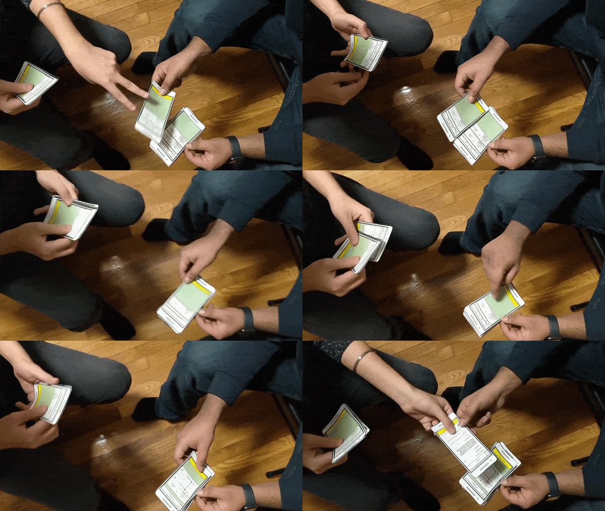
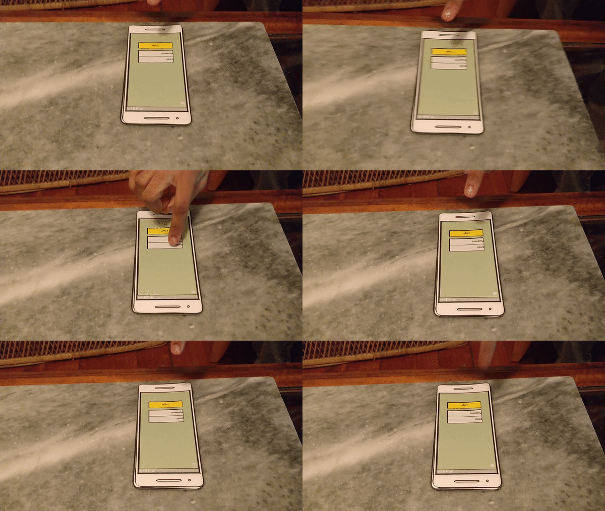
User 1
- Confused by the back arrow present on the confirmation screen.
- Was not able to see the details tab clearly.
- Wanted to see the older trips as soon as he opened the app.
User 2
- Thought the recommendation tab was redundant.
- Confused by the details on the checkout screen.
- Wanted an option for downloading PDF ticket due to familiarity.
User 3
- Wanted the trip details screen to be replaced with a popup to make it more intuitive.
- Questioned the position of the menu for a large screen phone.
- Wanted to know the nearest stop from their home.
Information Architecture Modification
After gathering the user feedback, the workflow was modified to include some user suggestions as well as pain points observed in the Wizard of Oz tests.
The navigation process was further simplified into two activities-
The navigation process was further simplified into two activities-
- Primary Activity which involved the entire end-to-end ticket booking process.
- Secondary Activities which involved the trips, locations, user profile and additional information related to the app.
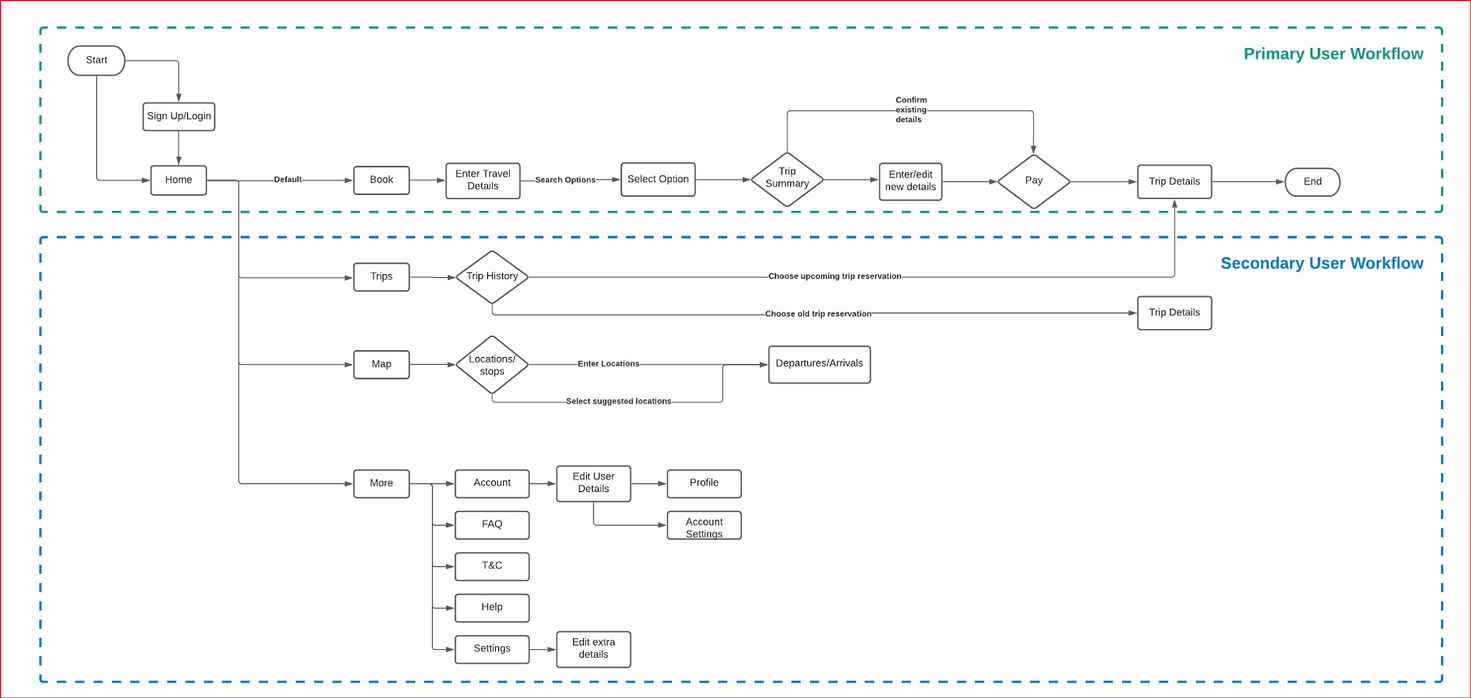 Workflow breakdown to prioritise user screens
Final Design
One of the challenges was to present the necessary information without overwhelming the user. The lists were changed to a card-based format for better hierarchy, improved scannability and information recognition.
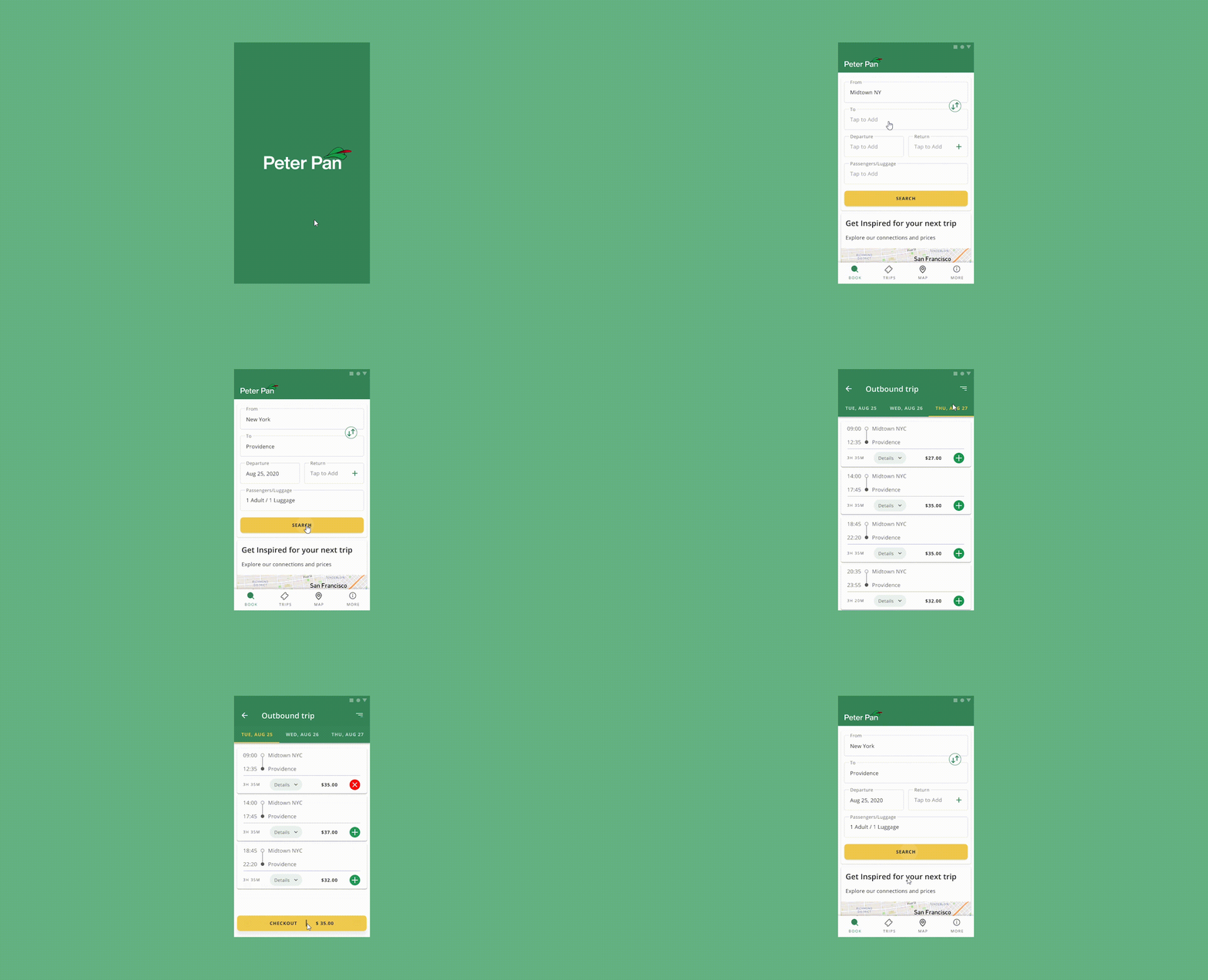 Improved UI for the primary user workflow
The hamburger menu was replaced by the bottom navigation bar for ease of navigation and better content structure. Additionally, the More section was added to help the user edit personal information or address any queries or questions about the app.
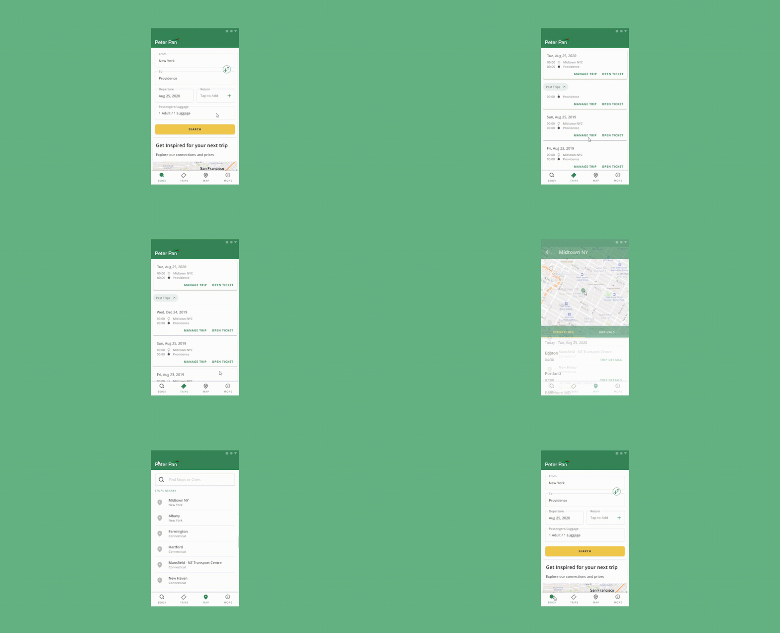 Redesigned bottom navigation bar for secondary user workflows
Remote user testing
HYPOTHESIS
The first-time user will easily identify the desired location and select the option from provided list rather than inputting the location. They will look at the trip details before booking their journey.
The user will only glance at trip confirmation options and scroll for other details about the journey.
The complete time taken by the user will be approx 2-3 mins to complete the task of booking a trip.
The user will only glance at trip confirmation options and scroll for other details about the journey.
The complete time taken by the user will be approx 2-3 mins to complete the task of booking a trip.
MAIN TASK
The task is to successfully book a trip from New York to Providence as a first-time user of Peter Pan Bus Lines.
SUB TASK
Feedback & Metrics
The users spent more time on subtask 1 which indicates that it was not intuitive. The users also spent less time on subtask 2 which affirmed the hypothesis. All the users spent around 3 mins completing the main task which affirmed the hypothesis.

CONCLUSION
- The users felt more stuck at subtasks 1 and 2
-
The misclicks for subtask 1 were around 66%
-
Users were confused while selecting details
Improvements
Based on the feedback, the details component was one of the problem areas. Users preferred details in card interaction over the alternatives, as seen below
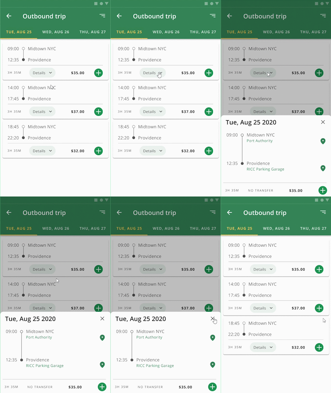 Details
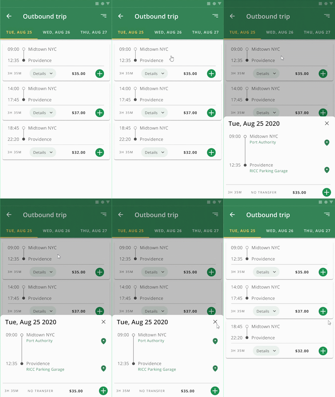 Card
Card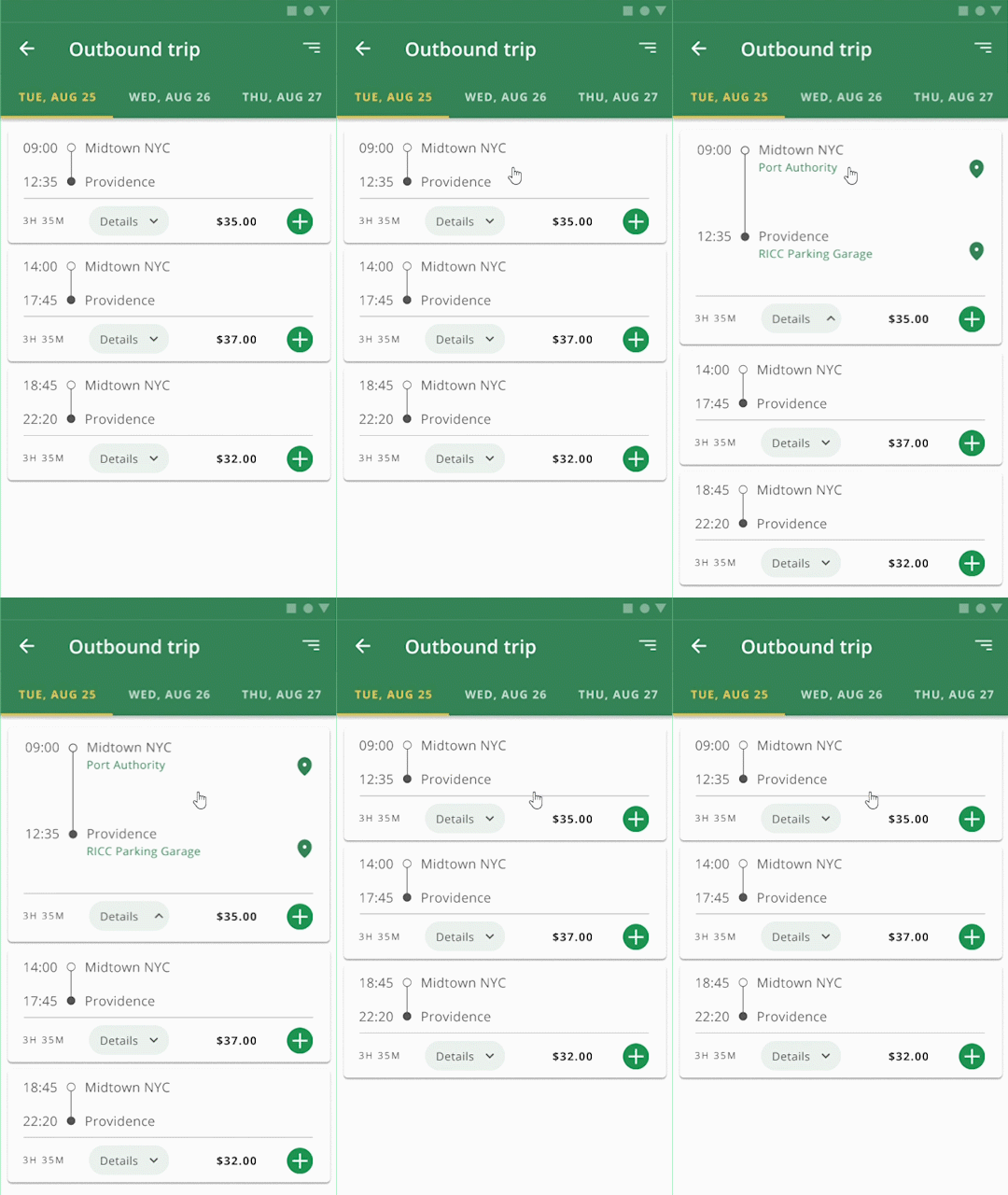 Details in Card
Takeaways
CREATING A DESIGN SYSTEM FROM SCRATCH
This redesign of Peter Pan's mobile app includes a design system to help prioritize user workflows over visual design.
REMOVAL OF SUPERFLUOUS COMPONENTS
Having a card-like visual system helped simplify the necessary content for the user.
PRIORITISING INTERACTIONS OVER SCREENS
User testing with metrics provided insight into how to improve component interactions rather than adding additional screens.