Naloxbox+
Rebranding for Naloxbox, a public access Naloxone kit for opioid overdoses
Read more about Naloxbox here.
The Ask
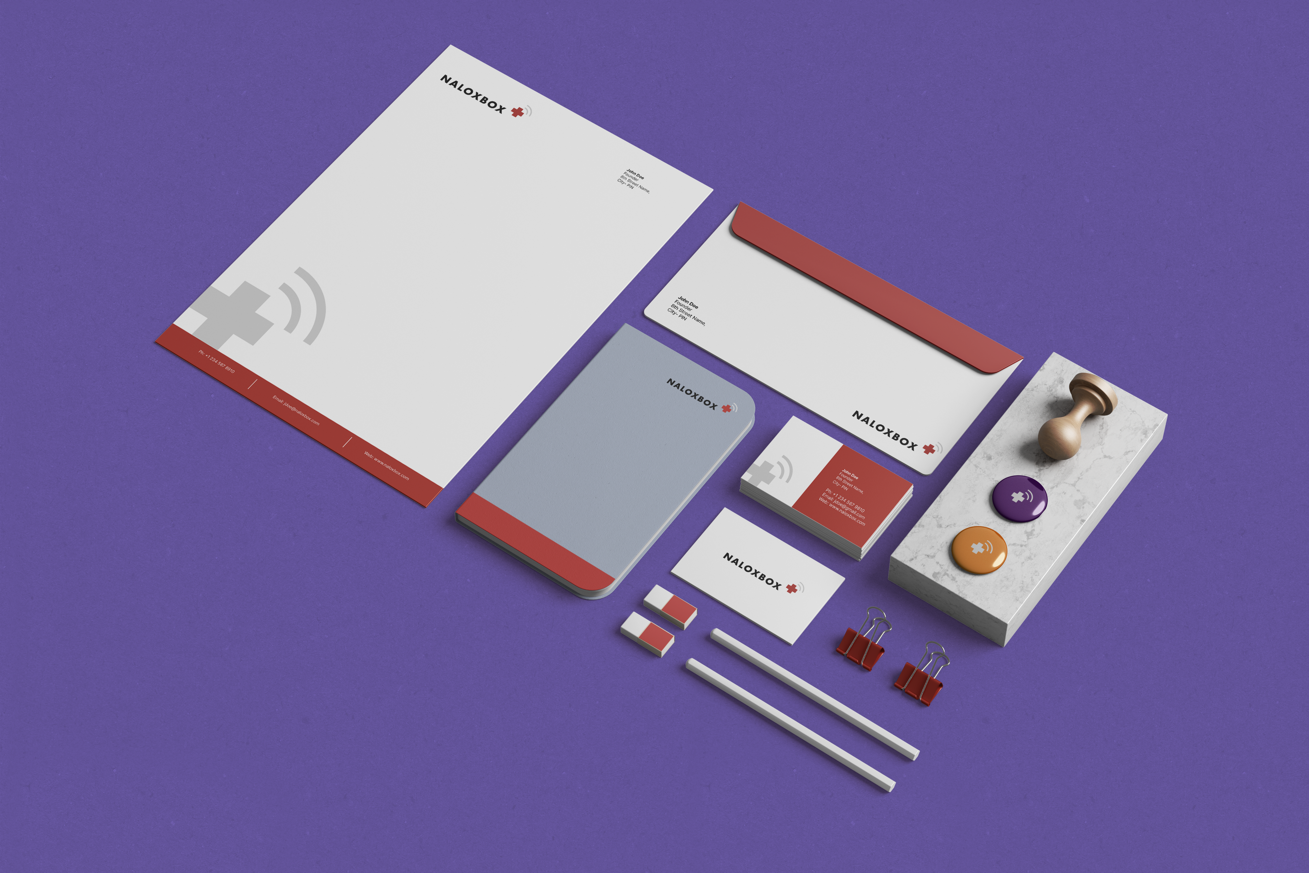
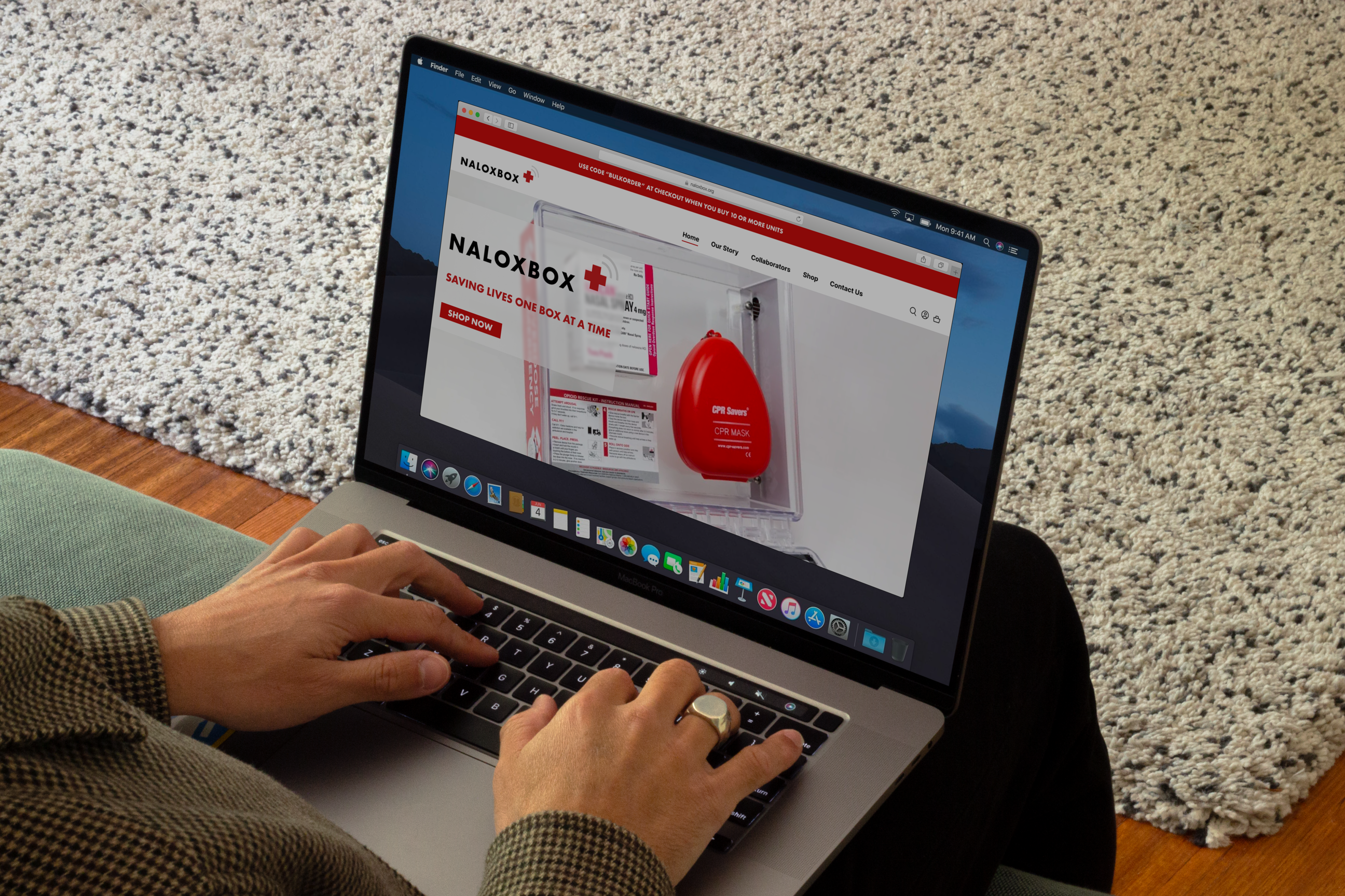
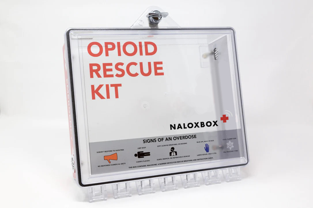
Naloxbox+ is an IoT-based solution to public access Naloxone and opioid overdose response tools. I was asked to redesign their logo and create a corporate brand identity for usage across internal communications.
Timeline
August 2023
2 weeks
Project Team
Ashesh Gohil
My Role
Brand Identity
Graphic Design
Brand Guidelines
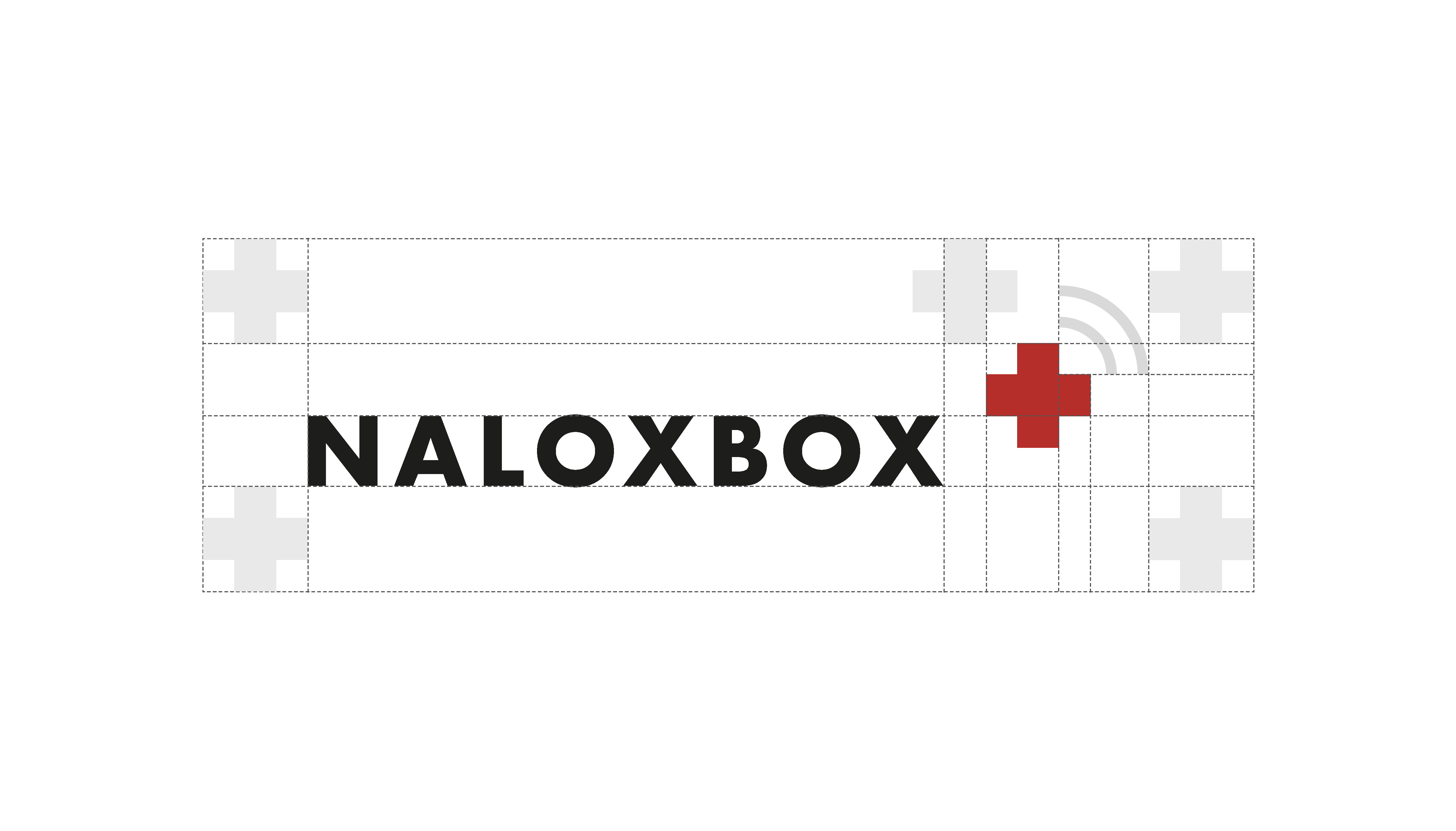
Redesigned logo


Colors
The colors for Naloxbox+ are emergency red, stark white, dark suede, cloudy gray and overcast. Emergency Red is an important color that centers around the identity of Naloxbox+. It should be used to highlight important texts,and create delight at interactive moments between the user and the brand.
The secondary colors are pulled from the set of color codes in emergency measures. Protective Purple, Recovery Blue and Alert Orange highlight different levels of medical emergency. They should be used sparingly throughout digital or physical media (like illustrations, posters, social media etc.), but not on the box itself

Typography
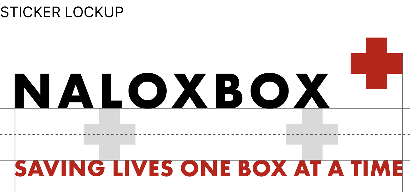
Futura PT Bold is used for the Naloxbox+ logo and tagline. It carries on from the original Naloxbox logo. Inter is used across the brand communication. It complements Futura PT by aiding in readability and is also open-source.

Logo Misuse

Context
